Nokia Store instead of Marketplace for Lumia in Nokia Lumia video?
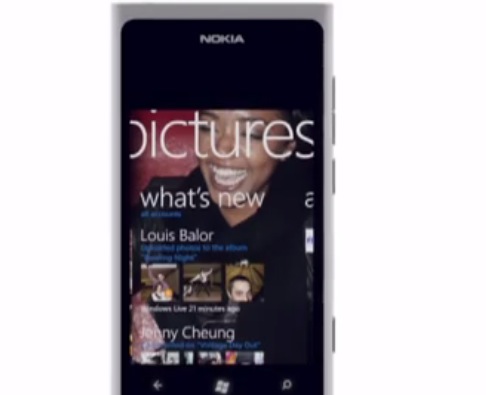
There’s a really beautiful video of the Nokia Lumia 800 in white at YouTube.
by NokiaHomebase
If it looked familiar it’s because there was another video like it, for the Nokia Lumia 800 in black. But they didn’t simply change the colours, the animations on the screen are totally different.
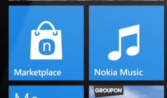
One thing that I really like is how marketplace’s icon has the Nokia Store icon (not simply Marketplace with Nokia Squircle). Let’s go ahead and change the home button as well please :p. I think it’s just probably part of the marketing rather than actual changes. But now that we’ve got a taste, I want more Nokia in my Lumia.
The Nokia Collections portion is great but that should be expanded even more. The dream is obviously for all Nokia OSes to support Qt. Imagine Windows Phone 8, Apollo with Qt. Qt apps for Lumia and hence the library from Nokia Store. At the same time, still have access to the original Windows Phone app catalogue (now at 70,000, all technically compatible for all WP7 phones)
Here’s one for the original lumia.
Nokia Lumia product film from DesignStudio on Vimeo.
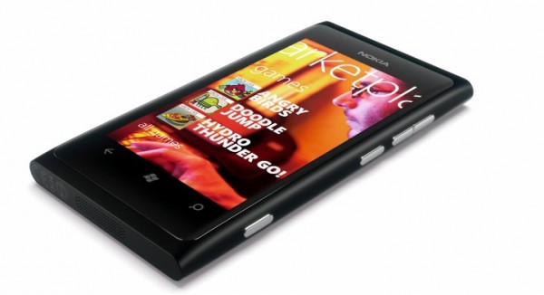
Most likely it’s just an error. I mean look at this, the simulated screen is not even where the Lumia’s screen is. The top of the screen is above the volume button.
Like this
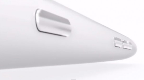
It’s so sleek/futuristic/space like! Like something Ive would be super proud of. Very Wall-E’s Eve.
This chilled out track is called ‘Intro’ by The XX. (Many awesome tracks. Loved ‘Island’ . Soooo Mellooow ^_^).
http://www.youtube.com/watch?v=L73OLaG4_kA
Category: Lumia, Nokia, Windows Phone


Connect
Connect with us on the following social media platforms.