Windows Phone notification central (CONCEPT)
Central location for all notifications seems to be something many people wish they had in their Windows Phone devices. This is a very convenient feature to have, so there is a certain justification for that demand. Notification centres are a great way to show users all the new content that requires user’s attention and to make sure nothing important goes unnoticed. All other big OS out there have implemented their own solutions for this, but WP is still lacking similar feature.
So there is no universal place in WP7 for all the notifications received. WP8 might bring a new solution for that, but currently there’s no information if any new notification system will be implemented. WP relies on displaying notification information on Live Tiles by displaying a number of new items inside appropriate Live Tiles. While this technically does count as a notification, it’s a very inefficient and uninformative way for doing that. Even with new items, Tile appearance will remain the same (color, size) as other Tiles and the distribution of Tiles require scrolling around to check if there are new notifications.
The problem lies in Metro UI
There have been plenty of different fan-made concepts how this could be implemented also in WP involving third home screens, modified toast notification screens and pull-down menus, but those all require messing with the Metro UI more or less. This is problematic as Microsoft is really committed to the Metro UI and if a new solution deviates from Metro UI too much it becomes unfeasible in reality, no matter how effective the solution might otherwise be. Metro UI has plenty of good points with its fresh, clean look and intuitive animations, but it is also quite rigid in its guidelines. This is especially true when it involves the home screen, the place where notifications should somehow appear as it is the starting point for the user.
Because of this, I feel that the only feasible solution (with the current pre-WP8 premise) for centralized notification system for WP is an application. If the notifications would be implemented by an application, it would give much more room how to display and interact with the new notification items. The application itself would of course get its own Live Tile, which would show condensed info about all the current notifications. As this application would require to have access to pretty much every user data and preferably also have a double-wide Live Tile, it would require it to be a 1st party application, something that’s available only for Microsoft or Nokia.
Possible solution by Nokia
If Microsoft won’t be changing anything about how the notifications are handled in WP8, Nokia would still have an option to do their own solution for that. While Nokia has said loud and clear that they aren’t going to mess with the WP8 UI with anything drastic like squircle tiles, with an application-based solution they would just be offering another Lumia-exclusive service, something they’ve already done several times before, like for example with Nokia Reading. With Notifications application they would actually have quite nice feature to differentiate themselves in the WP market.
One challenge would still be to figure out only how to effectively inform user about the new notifications (author’s note: Nokifications?) without going against the principles of Metro UI. WP8 might bring some viable options to execute centralized notifications but since we don’t really know much about WP8 yet except that it will have Live Tiles, I’ll only consider next how it could be implemented in the Mango.
Dynamic Live Tile for Notifications
To ensure that the user won’t ever miss a single new notification and that the user also gets condensed information about them with a single glance, I propose a new special Notifications Live Tile (henceforth referred as NLT) for the notification app made by Nokia. To put it simply, NLT would be a double-wide Live Tile that appears only when there’s a new notification. NLT puts itself on top of the home screen above users Live Tiles and remains there until user has acknowledged the new notification by accessing it through the notification app or the said application from which the notification originates. Or maybe simply after exiting the app after opening it. After user action, the NLT simply disappears from the home screen. To push the visibility a bit further NLT would be of different color than the current choice for accent color, preferably something around the complementary color region.
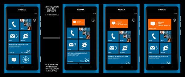
Example illustration of Notifications Live Tile. When new notification is received, new Live Tile appears on top of the home screen and pushes the other Tiles down. In this example, the user has previously dismissed notifications from the Twitter and Mail without accessing them. New notification makes the NLT appear again, as new Whatsapp message is received.
This implementation could be one way to effectively solve the native notification problem for many people in Windows Phone without intruding user experience too much or deviating from the Metro UI, which is the biggest challenge. While it does allow access to notifications only from the home screen instead of everywhere like for example in iOS, similar transient notification logic has already been proved to work very well in the MeeGo Harmattan of N9. There is also plenty of alternative options to handle the NLT, such as keeping it static but changing color when new notification is received making it effectively act almost the same as Symbian Anna notification widget. I personally prefer my original suggestion, as I feel that one would provide appropriate amount visibility for the notifications without sacrificing any screen estate.
Notification application functions
The notification application itself would only be a repository of notifications displaying condensed information about new notifications, eg. New e-mails, messages, twitter mentions, software updates etc. Items in the application would be only links to their native applications. It’s not wise to enable any further functions than that as it would require plenty of unnecessary coding effort. It could possibly be used also for browsing other notification-related information in separate pages, like reminders, today’s calendar items or to-do lists. Perhaps an option to generate notification from those items (when due) could also be useful.
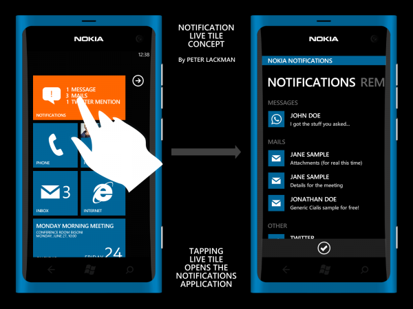
Example illustration of Notifications application. Notifications application will show condensed information about all the notifications received. Note that this is just a quick illustration, I didn’t bother to polish the UI for the application so there’s stuff missing, wrong marginals etc.
There you go. Simple proposal how to add a feature missed by many people.
Category: Concept, Lumia, Mango, Windows Phone
About the Author (Author Profile)
Hi, I'm Peter. Nokia, Windows Phone and UI/UX design enthusiast.Comments (37)
Trackback URL | Comments RSS Feed
Sites That Link to this Post
- Windows Phone Zentrales Benachrichtigungs Concept !! | June 3, 2012


Swiping to the left of the homescreen would seem like a logical choice to display a notification list.
To the left notifications, to the right the apps list.
Also, speaking of swipe. I wish the email app would support swiping left and right to go forward and back through emails.
Yes this is the best solution, left for notifications, right for app list. But even so, it seems redundant. i don’t need to see the actual message in the notification. Once i see i got a missed email,message or phone call i click on the tile. Too much trouble for nothing.
In the end seems like the best solution is a separate app that you can pin to your start screen
No, swipe to left would be great for Harmattan-style multitasking. WP doesn’t need a notification system, developers just need to take better advantage of the live tiles, for example displaying in the phone tile not just “3 missed calls”, but the names or numbers of the people that have called. If this system for notifications is implemented, there is no point with Metro.
More creative utilization of Live Tiles does not remove other problems that I mention in the text, like visibility and the fact that Live Tiles are spread throughout the home screen.
For a great UX, user should never have to search for the notifications.
I think precise buttons would be more clear and comfortable.
Swiping to the left has been suggested previously by some concepts, but I don’t see that happening unless WP8 changes the Metro UI to a direction that will enable it.
Why would WP8 need a change of the Metro UI to enable it? It is a natural gesture that is present throughout the entire OS.
So far from all the concept I’ve seen, the only that makes sense is a N9-esque 3 pane homescreen with the notifications to the left.
It’s not about gestures, it’s about the home screen arrangement.
If you enable swipe to the left, the negative space and the arrow indicator in the current home screen becomes redundant and effectively breaks the Metro UI.
If 3-screen home screen should be implemented, it would require extensive modification of Metro UI.
Who made the concept renders?
Delicious
Peter Lackman made these renders
They’re Peter’s designs. He’s created a few of his own here. I like the creation of that always visible tile and how it prompts you to check your new messages.
That notifications page once clicking the tile would be a cool ‘third’ screen for swiping to the left, like the N9′s notifications.
This would be different as it’s not just a continuous feed of facebook/twitter, but just the messages addressed to you.
Why not have an always visible top status bar with small icons indicating new messages etc., and a drop down menu for further info and ways into the respective program? Is it too practical for Windows Phone?!
what would be the point of the tiles notifications there? you move the notifications in a drop down menu or a 3rd screen you live the phone and message tiles static. it completely makes metro pointless. and if let’s say give metro, you end up with a normal looking ui like android,ios,symbian,bada. no originality in that
But you haven’t always got all of the apps installed on your phone on your home screen, so it’s nice to know whether you’ve got something in the apps that are not pinned to your start screen.
It would work, but as already said it would break the Metro UI. This concept was done with the premise that as little as possible is changed.
you’re pointing at a central question regarding mobile phones. mobile phones are not just phones but more generally a communication device. so you need to get notified when you receive a new information.
first question is what do i want to get notificatio for? in my case i want rss feed notification, mms, email, missed calls, audio messages, facebook…
i am still hestatig between 800 or n9. i was looking for information about notification in the the tows systems but did not find lot of things.
- for example do you get notifications in wp for facebook on home screen (tile)?
- what sort of notification you get on locked screen in wp?
- in wp do you get a pop up or just the number incrementation in the tile?
- in meego do you have notifications for skype? ect…
i would be very interrested if you could make an article comparing wp and meego notifications.
so far i still beleive meego is the best system for me. only drawback is the lack of apps.
MeeGo indeed has wonderful execution of notifications. This concept actually has a lot of similar elements to it.
read.
I’ve come up with another solution while reading your article. What about a “Notifications” button, just like the little arrow ( used to switch between the 2 home screens ). It would appear only when new notifications are ?available? and if you click it it would open something like the one in the picture.
That would do the trick, but there would be good chance to miss it.
It would also be impossible to tell the user what kind of notifications there are.
You can always see the kind of notification youy have on the lock screen.
This article is a utter tease! I love the idea and I’m suicidal without such option, I wish this already existed.
ah, swipe ui is still much better than this…
and btw WP needs something like symbian in the notifications list wifi, bluetooth…
I agree, Swipe UI is the best UI out there at the moment.
I have an another concept about wifi, bluetooth etc too, I just haven’t made the graphics yet for that.
Hehe. kinda funny that in order to make Mango better you have to make it more llike Maemo Harmattan. Still, the focus of this article is a nice concept staying true to the Mango paradigm. Features like this would have gone a long way towards convincing more people to try WP. Not that its bad or anything, I just wished it pushed more buttons in Symbian and N9 users to make them consider trying it.
I kind of get the idea of this, but WP7 is designed to have all notifications in the live tiles.
If you wanted to see your missed calls, messages and twitter mentions, just place the “Phone”, “Messaging” and “Me” live tiles next to each other and wait for them to announce of missed details.
Looks good, but its a kind of double functionality. All this is already in the system.
Yes, for this part Metro is a flawed design.
The “solution” of clustering all the needed Tiles together is not good enough as the lack of central notifications keep coming up when WP features are discussed.
Centralized notifications are always double functionality by default, but that does not mean it’s useless.
@Peter
I don’t get this sentence:
“While it does allow access to notifications only from the home screen instead of everywhere like for example in iOS, similar transient notification logic has already been proved to work very well in the MeeGo Harmattan of N9.”
Notifications ARE accessible everywhere in Harmattan via the status bar.
They’re not only accessible via the feed home-screen or the lock-screen.
At least certain notifications are as I recall, don’t have N9 in front of me ATM.
*BUMP* @Peter
Got 5mins to address my last post? (above)
Thank-you.
I seem to have missed that one somehow…
Some notifications are visible in the N9 status bar (for example small blue icon for new email) but they’re not actually accessible from there. For that, you have to either go the Events home screen or to the mail application.
@Peter
Yes you are correct….
But I do vaguely recall efforts to change that, can’t find the relevant discussion now.
If I have time to do a better search & find it, I’ll link to it here.
Plus there’s definitely efforts to allow a wider array of notifications there that remain un-launchable.
Michael posted about that recently IIRC…
Cheers!
@Peter
Yes you are correct….
But I do vaguely recall efforts to change that, can’t find the relevant discussion now.
If I have time to do a better search & find it, I’ll link to it here.
Plus there’s efforts to allow a wider array of notifications there (still un-launchable).
Michael posted about that recently IIRC…
Cheers!
I would gladly take the solution where you swipe to the left for a list of all notifications.
The only viable solution is to go with a swipe down notification bar. It’s the fastest to access and it would be accessible no matter what you were doing. That’s the beauty of it. If it were up to me, it would always be visible no matter what.
I don’t see how any of you could think that this would mess with the Metro UI in any way. There isn’t one single swipe within the UI that involves a swipe down gesture from outside of the screen. It would only make it better, and it would fit very well since the UI loves gestures. Plus, it would allow developers to create notification bar shortcuts, allow them to use it for weather notifications (iPhone), and even more.
Maybe I’ve spent too much time with Android and fell in love with such a brilliant concept, but when Apple implements the same concept within their UI, that says something about how useful it is. Heck, even Belle has it. Now if WP would just adopt it…
That’s a cool concept but that doesn’t solve the problem of receiving notifications in another app. What if I’m in my email and someone mentions me on Twitter, I still won’t know. Also, why consolidate the notifications? Tiles already do this!
For receiving notifications while in an app, there’s toast notifications that you can tap to access said content.
The Live Tiles absolutely don’t do this. You have to browse through your Tiles to check if any of them have new items and the notification of itself is too subtle for my taste (icon vs. icon+number). How is that consolidated?