My Dream Nokia: Nokia Lumia 908 with stunning Apollo WP8 concept slides!
I got an email from Andy Weir of NeoWin who has created a very long and thorough concept of what he thinks should appear in WP8. Sadly, I think he’s produced something that’s a little too awesome and no where near what we’d see in the actual Apollo. The device is not actually what this post is about. This is all about the WP8 concept.
There are 12 slides, discussed and explained at depth which I suggest you take a look at over on:
http://www.neowin.net/news/a-vision-of-windows-phone-8-and-how-microsoft-could-enhance-the-platform
I’ll briefly talk about some of it:
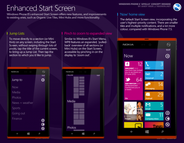
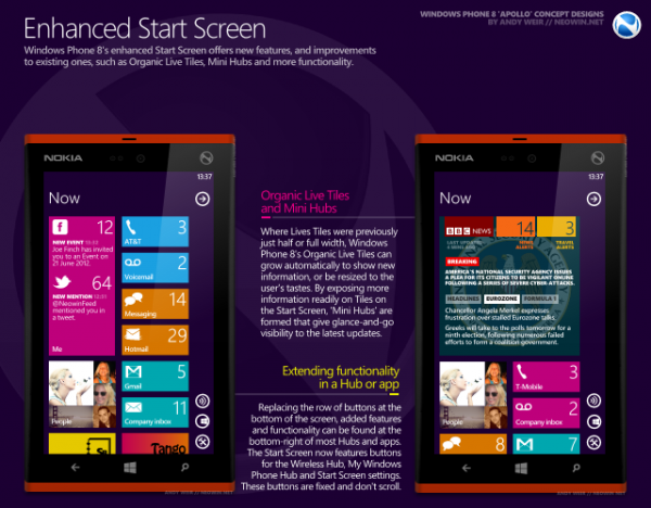
Very interesting set of live tiles. They’re mostly smaller, but can grow organically to display more information.
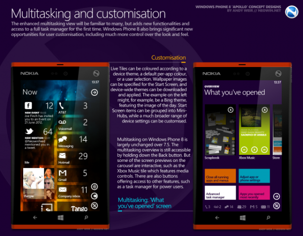
You can customise it, beyond simply just changing the colour theme. I like that the tiles themselves don’t have to be one uniform colour for the core apps (relying on you to customise it with your own apps to get colour).
The multitask view has the same linear swiping (I would prefer N9/N900 grid style) but now it has several options below (such as close all apps) and notifications at the bottom. I like that in WP, you don’t need to ‘close apps’ as the memory management means you never need to in order to save battery/RAM etc. But it’s nice at least to have that option.
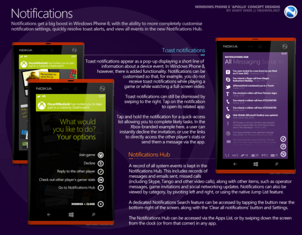
This is the notifications page:
These are accessed by swiping down from the clock. I would also not mind having that left swipe from tiles so we would have the same N9 arrangement.
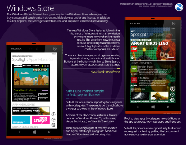
The store presentation of apps is more Metro like. Â I guess here it’s getting a little too busy in some places.
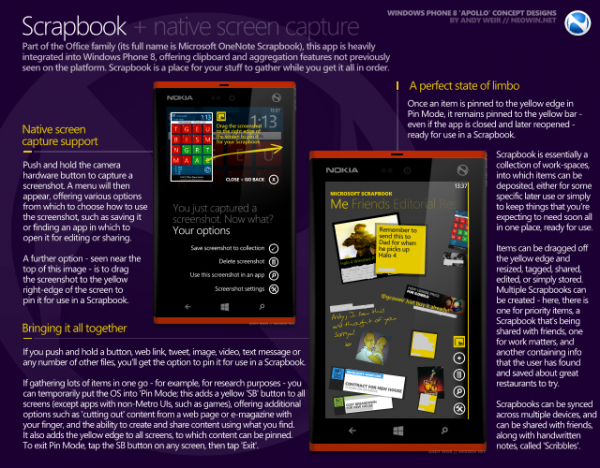
This one’s a very cool addition. They’re not just adding a feature of ‘screenshots’ but making a useful, user friendly feature of it with scrapbook.
I am not sure the implementation will work, “push and hold camera hardware button”…wouldn’t that activate the camera? Easy to fix. Two button combo – volume down and camera.
Well, Andy Weir:
One thing I would wish is to have touch buttons that are part of the display, as seen in
#49: Nokia Lumia PureView 920, Windows Phone 8 Concept
The only thing that disappoints me is that MS and Nokia are too far into WP8 and that their phones may not be anywhere near as exciting looking as this. 🙁 Please prove me wrong Nokia & MS.
If you’ve read this and want more info, go check out neowin. These are merely half the slides and none of the actual explanation to them. Go, go, go! 🙂
Source: Â neowin.net
Thanks Andy Weir for the tip!
Category: Concept, Dream Nokia, Nokia, Windows Phone



Connect
Connect with us on the following social media platforms.