Video: New WP8 homescreen demoed on random Nokia Lumia

| June 20, 2012 | 59 Replies

Ooh I really like the look of this all glass front Lumia. I hope there’s no additional frames, even if it adds colour it adds bulk! I don’t think there will be because the buttons are already visible on the side.

Here’s the official video

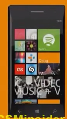
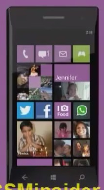
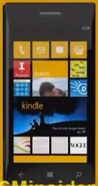
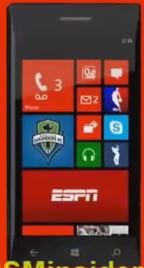
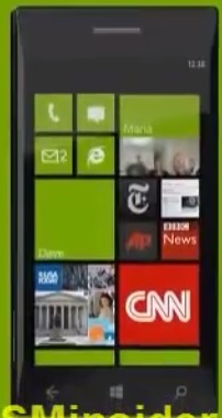
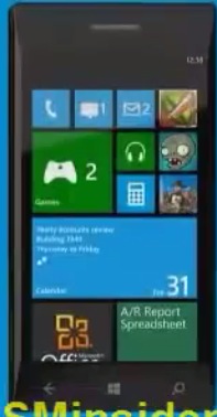
Anyway – here’s a video of a simulated WP8 screen on a new curvy lumia:

by 


Category: Nokia, Windows Phone

About the Author ()

Hey, thanks for reading my post. My name is Jay and I'm a medical student at the University of Manchester. When I can, I blog here at mynokiablog.com and tweet now and again @jaymontano. We also have a twitter and facebook accounts @mynokiablog and  Facebook.com/mynokiablog. Check out the tips, guides and rules for commenting >>click<< Contact us at tips(@)mynokiablog.com or email me directly on jay[at]mynokiablog.com

Comments (59)

Trackback URL | Comments RSS Feed

  1. Jill says:

    I am impressed with WP8.

    Dear Nokia, .. Your turn now. Get that ‘Amazing Hardware’ out of the box & put it on your first Lumia WP8 & F*** you if you are not the 1st one to release it.

  2. Vikas Patidar says:

    this make more sense. Now less used tiles can be placed as a 4 icons row

  3. AlsoCan says:

    So the mythical live tiles have actually only ever been just crippled widgets all this while :(

    • noki says:

      amazing right? :) ehhehhe

    • sdfanq says:

      hahaha +1

    • Jon says:

      They’re a combination of both widget and icon, while also sporting a unified graphical look. On iOS, all you have is icons. On Android, you’ve got either icons, or widgets. You do not have a icon that can show you information. On both, the graphical look varies widely, and can end up being really jarring. Especially with Android widgets.

      So no, they’re not crippled widgets. They’re improved widgets.

      • Deep Space Bar says:

        its the same shit as evryone else just tiles …..nothing new

        • Jon says:

          Eh? No-one else does live-tiles. iOS does icons, and Android does icons and widgets. Live-tiles allow info like widgets do, but also allow consistent and easy app-launching like icons do.

      • me says:

        If anyone wanted small widgets, they would be made. They aren’t useful, and thus, no one likes them.

        E.g. you don’t want to see today’s weather only in a widget (you can just look outside for that). You want to glance info for tomorrow morning and evening, also.

        • Johnny says:

          I have the next days weather on a live tile. And the current tile size is ok for it. But i also have a tile for my mails. And this is way too big now. I only want to the the number of new unread mails. For that, the small size is the right choice and i have room for three more small tiles.

        • Jon says:

          Please do tell me how a live-tile is worse than a icon? Does it not do the exact same thing, while at the same time being able to provide info. The weather tile, phone tile, SMS tile and e-mail tile, all good examples of how a small widget is useful.

          Please understand that even if you don’t see the point in something, that doesn’t make it pointless.

      • incognito says:

        How do you came to conclusion they are improved widgets? Can widgets do the very same thing Live Tiles do? Yes. Can Live Tiles do what widgets can (arbitrary sizes, run background code, allow user input)? No. So in what sense they are improved widgets.

        • Jon says:

          Because they’re unified in look and size, making UI navigation and info-at-glance that much easier as well as visually that much more appealing. They also work much better as icons, albeit as you said at the cost of user input. As for background code, I’m not exactly sure what you mean with that.

          • incognito says:

            You can unify in look and size widgets as well – heck, first Symbian widgets were just as restricted. And for me they are not visually appealing but visually appalling, beauty is in the eye of the beholder. Background code == run as separate applications and update themselves when needed. WP8 will at least give some background services, but nothing on a level of a proper widget.

            The plain fact is that Live Tiles are crippled widgets, or something between an icon and a widget. Whether you like them or not, that’s a whole other topic.

    • Jed says:

      Nope, but no amount of explanation matters to fanboys.

  4. noki says:

    wow, total control of the tiles, aka one more size, wow :)

    • SLAYER says:

      it’s now more personal!

    • poiman says:

      You couldn’t choose the size of the tile for each app. Now you can, according to your priorities.

    • Mark says:

      Wow. You really area piece of work. First of all you bitch that WP is terrible because it doesn’t have features like… umm… variable size widgets then you bitch when it does.

      At least your consistent. Hypocritical but consistent.

  5. Keith too says:

    Looks awesome all around.

  6. Luisito says:

    The best thing… the Lumia proto device… XD

  7. et3rnal says:

    All great, now im waiting for the PureView one :D

    did anyone saw how to access the app list menu ? as there is no arrow anymore? any swipe :D ? umm does it support folder?

    I wish 1 more thing “double tap to wake up” please nokia

  8. steelicon says:

    It’s definitely awe-something-something… (prolly awwwww…)

  9. larryg968 says:

    So now the tiles are just like icons when the tile is small. The main difference is tiles are flat. When expandable is becomes a widget with far less information.

    The screen looks super crowded and confusing. Wow

    • poiman says:

      It can be confusing if you want it to be confusing. If you want you can just use the big rectangular tiles in order to have a more simplistic start screen… it’s all up to you.

    • Jon says:

      They’re still live-tiles even when small. And the amount of info when large depends on the live-tiles, doesn’t it? Personally I view the coherent UI of WP8 as much less confusing than either iOS or Android.

  10. Zipa says:

    What can I say… Please be quiet and accept my payment!

  11. eli says:

    this needs some sort of organization.

  12. me says:

    Most confusing POS of a mobile interface I’ve ever seen. But hey, that’s what a tightly-packed bunch of saturatedly coloured tiles will always look like.

    “Metro design language” allows for much less differentiation of iconography, and thus you’ll have hard time finding the app launchers you’re looking for.

    “Negative space” as a feature. Yeah, right.

    • Viipottaja says:

      As you can see on the sample shots and video, all 3rd party appps have a very different design. Plenty easy to differentiate and identify.

      Only WPs own icons have a similar design/iconography. But that’s not that different from other OSs – they all have their own design rules. And, the simple iconography of WP is arguably as easy or easier to identify.

    • Jon says:

      Most beautiful mobile GUI I’ve seen. But hey, that’s thanks to the coherent *pastel* colored tiles. .

      “Metro design language” allows for a consistent and coherent UI, thus it will be easy to find and organize your homescreen while at the same time keeping a unified look.

  13. ilan says:

    the first mobile wp8 will be nokia . if MS have other device brand name , they will used it also. the tablet was samsung ,not nokia .
    the guy from nokia was not ready. the guys from MS was great.

  14. viktor von d. says:

    i don’t like that they gave up tha black space in the right. it provided a nice contrast to the tiles and the ui looked slick. not it looks too clutered ocupying the whole screen. but i enjoy the resizable tiles.
    wished they kept the former layout of the star scrren and added suport for background wallpapers, or more color choices for the background and the apps,not just white and black/

    and there’s a lumia 900 running wp 7.8 on engadget. looks terrible imo
    http://www.engadget.com/2012/06/20/visualized-nokia-lumia-900-windows-phone/

    • From Engadget:

      “We were able to snap a few extra images of this very same Lumia 900, but we weren’t allowed to touch the screen or interact with the software in any way, since the build we saw of Windows Phone 7.8 is just a special version highlighting the Start screen and is nowhere near final production quality.”

      Weren’t allowed to touch the screen or interact with the software in any way! Sounds ready. :D

  15. Banderpop says:

    Along time ago, probably in the days of the original N-Gage, I recall a picture of a concept future phone that looked like a black glass pebble, rounded all over with no obvious edge to the display, or any openings or buttons. Possibly a camera wasn’t even part of the design. It was printed in EDGE magazine I think.

    I don’t know if the image has ever appeared online, but the picture in this news story is starting to look somewhat similar.

  16. aboodesta says:

    Why are people complaining? This is awesome!

    And for those of you complaining about tiles being too small, this is approximately the same size as an icon on the N9.

    Bring on windows phone 8 nokia. I’ll be the first in line!

    • me says:

      By someone’s account, it was a feature such small tiles were missing, and now it’s a feature they’ve adding them.

      The small size (also used in iPhone, and as you said, the N9) is PERFECT for an app laucher. You can see plenty of recognizable icons without the need for scrolling, and they are very much touchable. However, there’s nothing insightful about adding updates in the midst of app launchers, no. A much better place for notifications and updates is, well, how about, the NOTIFICATIONS CENTER? That can be implemented in multiple ways (I prefer the N9 way).

      MS is trying so very hard to be “different” that it fails to add any real value with it’s “live” tiles. I haven’t so far been surprised by the lack of general enthusiasm towards Windows Phone (bar the few vocal ones here), and I really don’t expect anything to change much. Windows Phone still adds little to NOTHING to the game, and is still lagging behind.

      • Jon says:

        Surely live-tiles are infinitely more useful than icons alone? I can’t see how a icon that can’t show info is in any way shape or form more useful than a icon that can. And while a notification center is useful in its own right, live tiles add their own value as well. Having to always drag down the notification bar isn’t nearly as convenient as always having the notifications next to your icons on your homescreen. Only once you’ve got lots of apps notifying you does a notification center really shine.

        In case you haven’t noticed, iOS does a similar thing to live tiles by showing small numbers next to their app icons with new notifications. The thing is, a live-tile can show more than simply a number.

        • me says:

          No it can’t. That’s exactly the problem.

          Oh, it’s a nice idea alright. Cycle news titles and incoming messages. But in reality it means you probably aren’t seeing what you need to most of the time, and thus you always want to, and need to, follow the tile by pressing it. No one has the time to just stare at the home screen.

          Notification center (or screen, as in the N9) will show you what’s new, in chronological order. Not just a random excerpt of what’s happening. Most important things like missed calls or received SMS’ are always there for you to see, even when the device is sleeping (AMOLED magic!) and you can jump to them, directly from the lock screen. There’s no need to push this information to app list.

  17. stylinred says:

    i have to say im impressed worlds better than wp7

    i have to say apple should be very worried

  18. me says:

    Pathetic ad videos, by the way.

    It gets kind of unnerving when the presenter congratulates the user for the Nth time for his purchase. I mean, it’s as if they’re unsure the product can sell itself (well, it sure can’t).

    “You’re so unique and so very special.” Who are these ads aimed at? Toddlers? Get to the point and stop babbling around. Not everything’s epic, and one doesn’t get anymore unique by dragging ICONS around (as if it couldn’t be done with EVERY OTHER PHONE on the market).

  19. Paul Grenfell says:

    No mention of pureview camera? Will it even be like the 808?
    Bluetooth file transfer? Wifi hotspot?

  20. Chan4k says:

    To avoid messy tile…Nokia should have developed customization similar to below video…:(

    http://www.youtube.com/watch?v=zV250BeRYFg

    Sorry Nokia, I won’t be buying windows phone.

  21. Jesus that looks even worse than WP7! *almost throws up*

    After 808 it’s either BB10 or Tizen. Nokia is a totally lost cause now. The abomination called WP8 will never be in my phone.

    It’s a sad situation, because I really liked Nokia and their phones before Elop made Nokia a Microsoft subsidiary.

  22. petejoff says:

    looks nice!

  23. T F says:

    Ewww, now you can have up to four columns of ‘Metro Metro Metro’ tiles on your phone. Yikes!

    Windows phones: do not care, do not want, and will never succeed.

    If I want a Nokia phone, I’d rather buy the Nokia 808 PureView or the Nokia Asha 311.

    And poor Nokia can expect many WP7 Lumia phones to remain unsold in the inventory. Say hello to the Osborne Effect.

    How many more layoffs and how much lower does Nokia’s share price have to drop before you finally realize that Stephen Elop is a FLOP, and no Microsoft partner has ever had a happy ending?

  24. DesR85 says:

    The way how those tiles are arranged in that video (and pictures) makes the UI look cluttered. But I still like the idea of customising the tile size. When 7.8 is released, I might give this a try and see how it looks. ;)

Leave a Reply