SwitchToLumia Infographic: Purple and Blue lumia 920?
Since I’ve taken much to long to write this, there’s already a post by Ali so let’s focus instead on the box at the bottom corner.
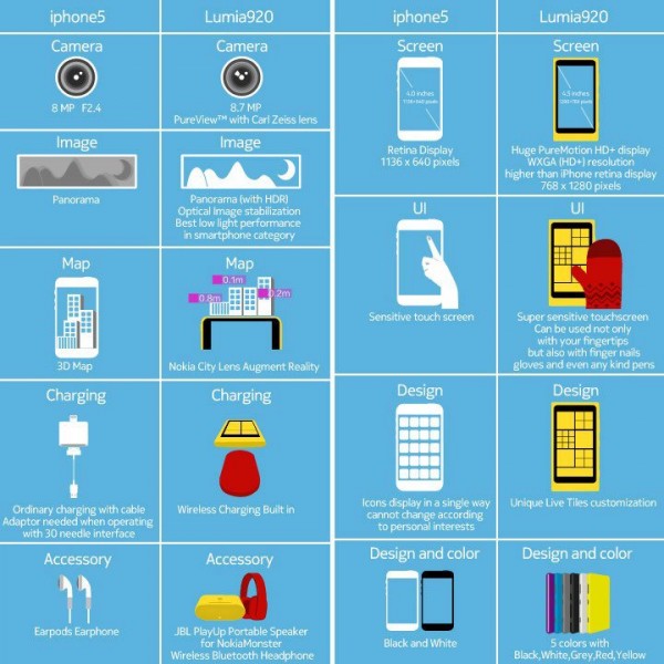
SirajSoft tweeted this image which he came across on the Nokia UK facebook page. It’s an interesting infographic that shows the differences between the Nokia Lumia 920 and the Apple iPhone 5.
Their message is “Good things come to those who wait”. According to our poll, around 72% of MNB voters so far are definitely going to be picking a Nokia Lumia 920 (an additional 6.47% will be getting a different Nokia, whilst 6.76 don’t even plan on buying any phone any time soon).
That super sensitive touch thing, although it might have seemed obvious but I didn’t realise you could use pens too. That pretty much means any sort of contact, right? That’s cool as capacitive pens suck somewhat. It would be also great to see this type of thing on a tablet.
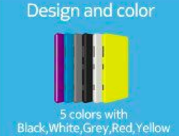
Also, check out this box.
The message says, 5 colours, Black, white, grey, red and yellow.
But there are six colours, no red.
Purple, blue, grey, black, white, yellow. Â This could just be a typo or more colours.
Category: Lumia, Nokia, Windows Phone


Connect
Connect with us on the following social media platforms.