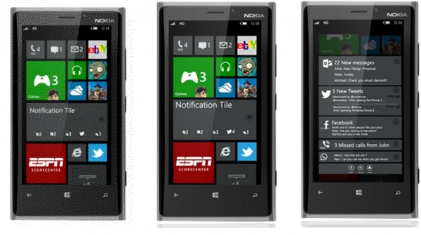
WP8 Centralised Notifications concept
Centralised notification centre. Not sure which camp you rest in regarding how WP should address this, but I’m siding with those that want to see an improvement. Me tile is ok, as is the lock screen info but that’s not enough.
I’d like a left swipe (aka N9) stylie, but with condensed information on notifications. It makes sense since there’s a screen for notifications, a screen for tiles and a screen for the apps. I like the presentation shown above but I think that just sits over the main tiles only after tapping the live tile.
Left swipe makes the most sense. I think BB has something similar (or an attempt at it anyway)
Source:Â Verge Forums
Via WMPU
Category: Lumia, Nokia, Windows Phone


Connect
Connect with us on the following social media platforms.