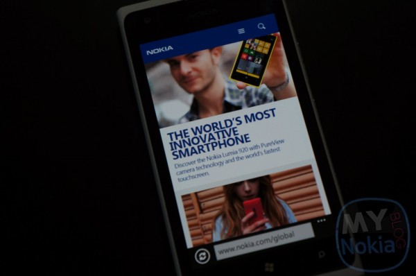
Official Nokia Site Redesigned, Loses the Formality, Gets Cozy

This one has been a long time coming, but Nokia have finally revamped Nokia.com, giving it a fresh new look that beats the old stale “select Region page”. The new site is colorful, vibrant and attractive, showing off the latest headlines and releases; and somehow manages to be professional yet informal at the same time; I love it! The new site also adds a bit of social presence to Nokia pinging back to teh pfficial Facebook and twitter feeds of Nokia, as well as posting some articles from Nokia conversations, not bad.
Check it out here:Â http://www.nokia.com/global/Â (note some of the regional sites are yet to be re-designed)
And most importantly the mobile site has also been redesigned to match the desktop version, and give just as beautiful of an experience. The reason behind the beautiful look on allscreen sizes is because the site is actually “responsive” to screensize, meaning itenlarges/shrinks depending on how much real estate is available, pretty awesome.
So what do you guys think? You like the new re-design?


Connect
Connect with us on the following social media platforms.