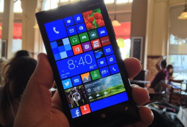
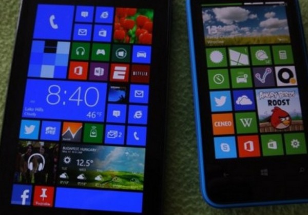
Mooooaar Tiles: More tile option for future Nokia Lumia Phablets (concept) 60 tiles in one page
Earlier in the week we heard news that an update to WP would bring in more tiles.
http://mynokiablog.com/2013/04/12/windows-phone-8-gdr3-to-bring-support-for-more-tiles/
With the impending appearance of Nokia Lumia Phablets pushing 5″ and over with their 1080p displays, it might be nice for WP to take more advantage of that screen real estate, rather than scaling the present tiles.
Someone did a mock-up of what that might look like and check it out. You’ve got that wide tile plus space for a large square tile on the side or 6 small tiles. You can fit as much information simultaneously on screen or as little. It feels even more dynamic and resembles W8 more, I find.
If you wanted, you could have as much as 60 tiles present in one viewing. Traditional grid icons are usually 4×5 (20) That’s 3 pages of apps in one viewing. Or, with just the large tiles, 10 on one screen. I prefer to have larger tiles spliced in now and again between many small tiles.
What other things can we do for the home screen? Just some ideas from our reader discussion on the previous post
- I’d like semantic zooming, so if I scroll, a little map appears to show me where I am.
- Rotation.
- Wallpapers/background colour
- Perhaps individual tile colours if you don’t want them all to be part of the theme.
- Optional landscape scrolling
- Transparent tiles option
Source: WPC
Via: Reddit


Connect
Connect with us on the following social media platforms.