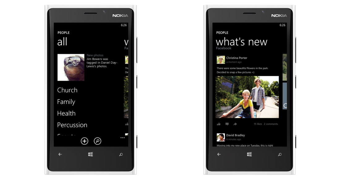
Concept: Windows Phone People Hub Redesigned
 Here’s another cool Windows Phone improvement concept, this time coming from the Verge Forums, the new refresh focuses and getting more functionality out of the People Hub/What’s New without losing the Metro/WP look (which everyone seems to be hurting about in the new Facebook app). The main changes are shrinking the size of the “people” header as well as getting more functionality out of the what’s new by adding users profile pictures next to their posts, and giving a large view of shared images.
This is the kind of change I want to see in future versions of Windows phone, not more tile sizes! (although they are also welcome) but I want more functionality out of some of the features that made me fall in love with Windows Phone in the first place.
Check out the rest of the re-design and more details at the forum post in the link below:
http://www.theverge.com/2013/5/2/4295668/redesigning-the-people-hub
Category: Lumia, Nokia, Windows Phone


Connect
Connect with us on the following social media platforms.