WP8 UI concepts inspired from W8 + New Metro
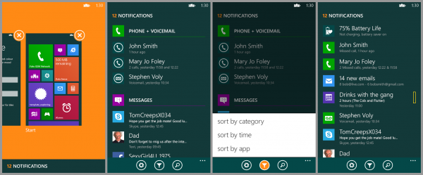
 Here are some design concepts for WP8 brought over from W8. After hearing about the WP8.1 leaks, seeing various notification styles, mdtauk on TheVerge forums decided to put his own spin onto the WP designs.  Note above, like Peter’s concept, the notifications are brought up by opening the task switcher. Though there’s no panel to tap, the notification message is at the bottom.
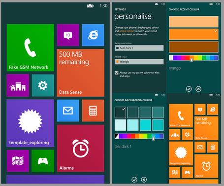
More personalisation on the tiles as in W8.

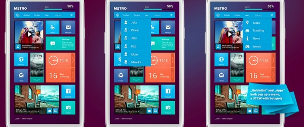
Alternatively, from a different designer, there’s a different metro style (Via Reddit)

Michael: The screenshots above are actually from an Android Skin. I was meaning to post about it, then I saw Jay’s article, so I figure I would attach it.
http://mycolorscreen.com/2013/05/16/metro-28/
Category: Lumia, Nokia, Windows Phone


Connect
Connect with us on the following social media platforms.