Video: @WindowsPhone 8.1/ WP9 Concept UI – so much awesome, gestures and swipes – @joebelfiore

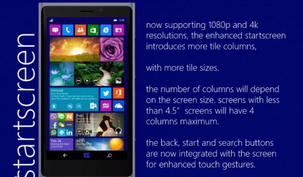
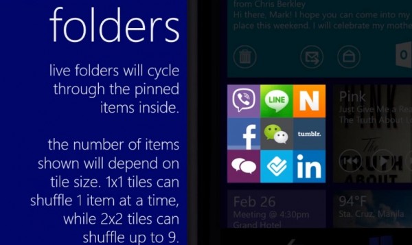
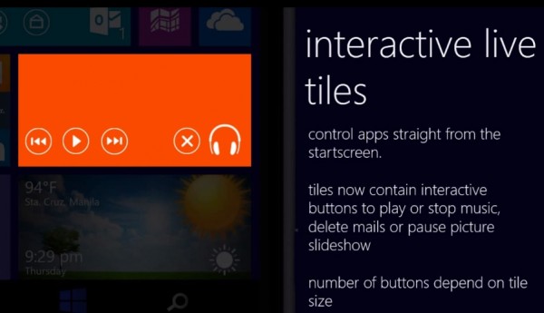
Here’s a video showing a concept of WP8.1/WP9 created by Christian Del Rosario. It’s worth taking a look at as it’s all animated (not simply images in a video).
The integrated search of the bing app means the search button is now actually something you would use and not something to shout at when you accidentally press it whilst playing a game.
The gestures are pretty cool. There’s so much awesome in this video. If this is what we see in WP in the next 6 months, it would be just what we needed. Swiping to switch between apps, swiping down whilst in the app to close an app like the N9/Swipe UI, right edge to bring up W8 like charms(pull further for notifications) and snap window multitasking like W8.
There are some concerns highlighted by some commenters at Reddit. It is very information dense. On a phablet, 5″ + this would be perfect, but possibly too small on 4.5″ 1080p? There’s a lot going on in some screens.
The “problem” with WP is that unlike the other OSes, it’s very strict on being coherent all the way throughout. The design principle and usability is ushered ahead of simply ticking the box of having the feature stolen from another OS/added from a new idea and just shoved in.
Heck, a Nokia phablet, with this, all still butter smooth and 1020-esque PureView V3 imaging? Shut up and take my money!
Joe Belfiore says MS/WP are listening. This is what pretty much most of us want.
Via: Reddit


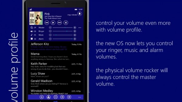
Volume controls

Category: Lumia, Nokia, Windows Phone


Connect
Connect with us on the following social media platforms.