
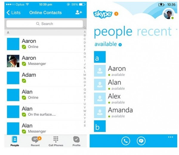
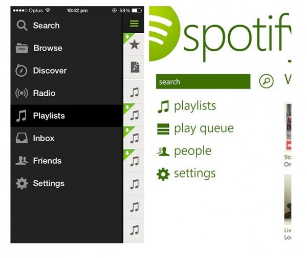
Flat vs flat: WP8 vs iOS7 app design
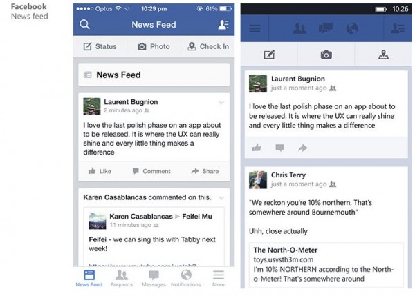
Up until iOS 7, Apple’s mobile OS was focused on these skeuomorphic designs as opposed to the WP flat approach. Then suddenly all came a “new” and “innovative” way as iOS7 invents the flat approach.
Long Zeng compares a selection of popular apps on both platforms. With developers updating to iOS7 styling, some of these apps are looking a lot more flat too.
http://www.istartedsomething.com/20131109/flat-vs-flat-a-comparison-of-windows-phone-and-ios-7-app-designs/Â Via Reddit
I want a scrollbar dammit!
I think WP8 spotify needs tweaking. Have the side tab approach like the facebook app. Also it needs the rest of the spotify features. Generally spotify sucks on all my devices. iOS/Android/Mac OS/Windows/WP but they have got me trapped with my playlists. But the WP8 client needs some updating again please.
Category: Applications, Nokia, Windows Phone
About the Author (Author Profile)
Hey, thanks for reading my post. My name is Jay and I'm a medical student at the University of Manchester. When I can, I blog here at mynokiablog.com and tweet now and again @jaymontano. We also have a twitter and facebook accounts @mynokiablog and  Facebook.com/mynokiablog. Check out the tips, guides and rules for commenting >>click<< Contact us at tips(@)mynokiablog.com or email me directly on jay[at]mynokiablog.comSubscribe
If you enjoyed this article, subscribe to receive more just like it.


Connect
Connect with us on the following social media platforms.