Windows Phone 9 UI Concept
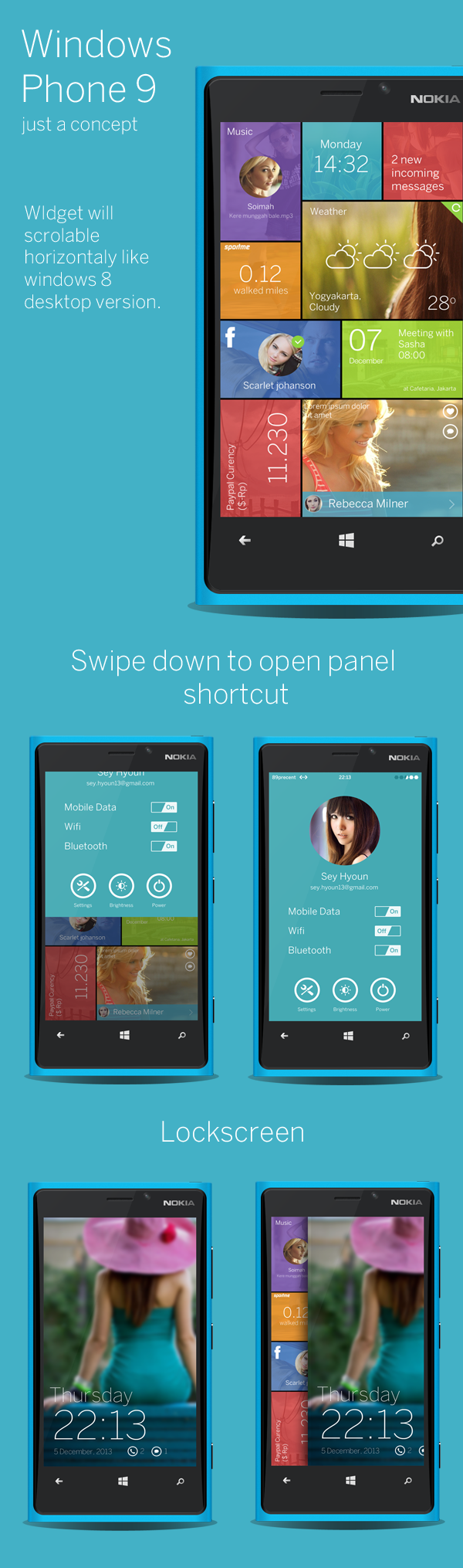
Here’s another nice concept of what the future of Windows Phone might entail, the main change being that the direction of movement on the screen is basically in a horizontal direction rather than the current vertical one. Unlocking the screen is by swiping to the right, instead of upwards; but I actually like the redesigned lockscreen notification, which give a clearer and neater look to the things you might have missed, instead of the current implementation which could come across as messy sometimes.
Swiping down from the top brings he settings panel, which I think is actually wasting a lot of space; instead of a huge photo of the users account picture that same space could be used for notification or something a bit more useful. The tiles themselves look a lot more nicer as they seem cleaner and more colorful, but the random vertical vs horizontal tile comes off a bit chaotic, plus the circular images come off as being heavily inspired by Google +, which is something Microsoft would never allow.
What do you guys think of the mock-up, which at the very list just gives a fun fresh new look at WP?
Category: Lumia, Nokia, Windows Phone
About the Author (Author Profile)
Hey, my name's Ali- Currently a fifth (and final) year Dental Student from Chicago; studying in Jordan. I love all sorts of gadgets almost as much as I love my cookies! Be sure to follow my Twitter handle @AliQudsi and Subcribe to my Youtube for the latest videos - no pressure. Thanks. Since my days as a avid Nokia blogger I've completed my studies and can be found doing Oral surgery realted stuff here!!Subscribe
If you enjoyed this article, subscribe to receive more just like it.


Connect
Connect with us on the following social media platforms.