Editorial: The Evolution of the Fabula/N9 Design into “Lumia”
Earlier this week while posting about the leaked Nokia Normandy image, I referenced the design as “Classic Lumia look” which got some interesting replies. This got me thinking about how the N9 design which was referred to as “Fabula” has evolved over the past two years since the launch of the Lumia 800 which mimicked the N9’s design in almost every way.
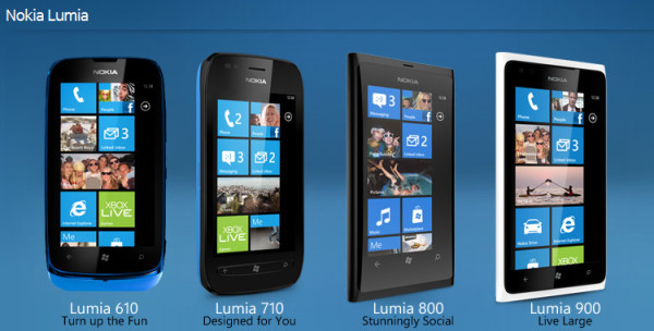
Alongside the Lumia 800 launched the cheaper Lumia 710; which almost everyone forgets about; later on the Lumia 610 also launched, which we all wish we could forget about, then came the Lumia 900 which was a blown up version of the 800 with a flat screen (it’s funny how big we thought the Lumia 900’s 4.3″ screen was just a while back). What happened though was that both the 710 and 610 went for rounded corners and a more “oval-like” overall design, while the 800 and 900 stayed true to form with very few changes; sticking with the sharp well defined corners as well as the same polycarbonate build of the N9.
*Fun fact: The Lumia 710 is the only Nokia Lumia device to have hardware depress-able Windows keys and not capacitive touch buttons.
After the Lumia 900 and 610 launched, Microsoft announced the WP8 upgrade, and Nokia alongside it announced 2 devices; the Lumia 920 and 820. Similar to the WP7 launch, two different design languages were present in these devices (admittedly though the differences weren’t as pronounced as those between the 710 and 800).; the Lumia 920 carried on with the original fabula look, still carrying the same strong corners and unibody design although the back of the device curved more; also at this point Nokia finally got the design factors in their lineup correct, instead of the scratch prone backing on the buttons and camera plate Nokia went for a black ceramic look which added class, as well as scratch resistance – an instant win in my books.
Meanwhile the Lumia 820 took a slightly different path, which although appears to be similar to that of the 920 does bear some resemblance to the 710 and 610 as well; which involves a removable back cover, rounded corners (and the in-ability to stand on its own 😛 ).
*Note: for the sake of simplicity and avoiding losing track I’m ignoring all carrier variants of the devices such as the 822/928 etc.
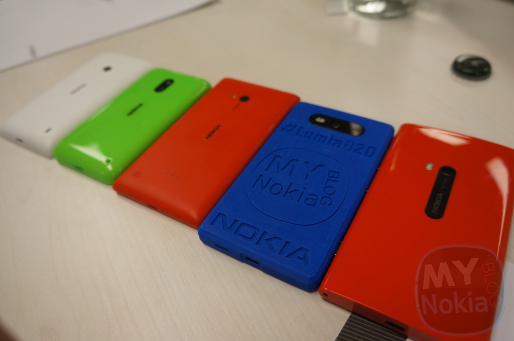
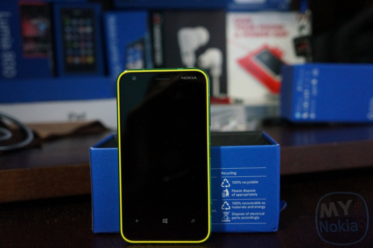
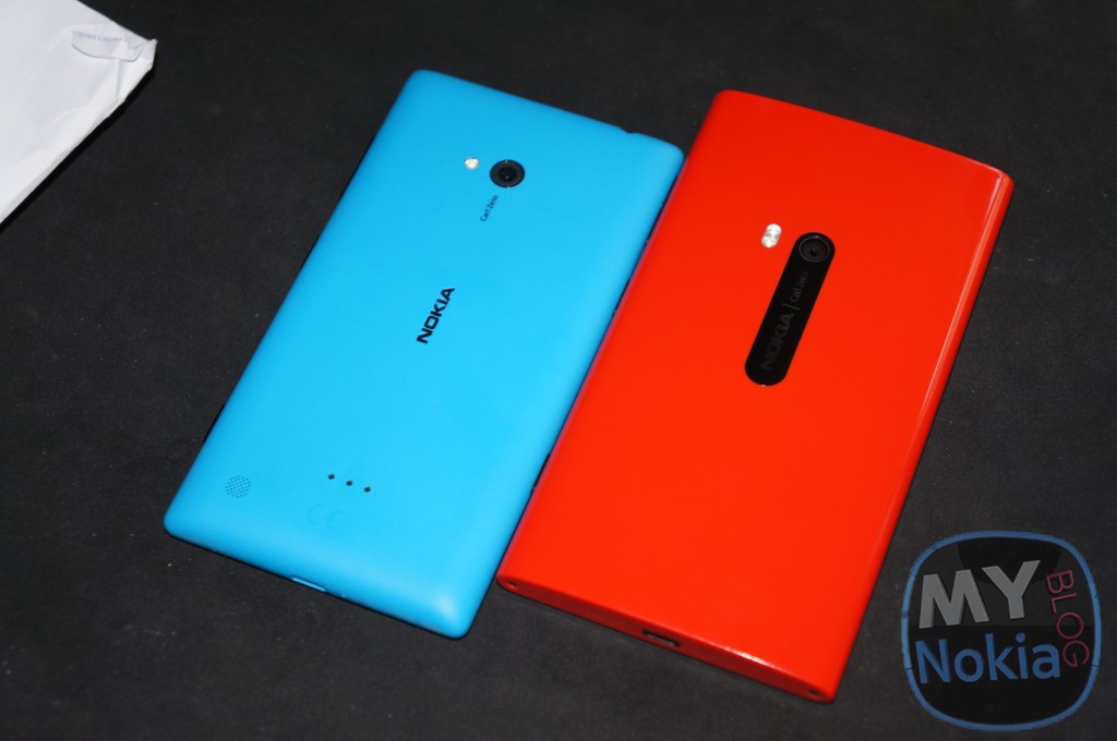
At this point though Nokia introduced something else that also drastically changed the “design language” or at least out perception of it, and that was the introduction of the new flagship colors (and the dropping of others). Along with the Lumia 920 and 820 Nokia introduced for the first time their new red and yellow devices (both in glossy at the time), and the elusive matte grey that not many have seen; also discontinuing the magenta color and giving the cyan a back seat. This is actually a pretty important step in the evolution of the Fabula design, as although the overhaul in the overall shape of the phone didn’t change much; it still provided the new devices with a distinctive characteristic, and something for us hardcore fans to fight over.
After the 920 and 820 Nokia varied away from the original Fabula design even more, by announcing the well-rounded Lumia 620. Besides deviating from the color schemes of the already available Lumias, as well as having a more overall rounder design; the 620 also introduced a new build material as well, relying on dual-shot plastic instead of polycarbonate; giving more vibrant colors that didn’t fade or scratch with time.
At this point the Lumia 620’s resemblance to the original Lumia 800, showing the subtle path the design language took over the course of almost a year and a half (from the launch of the 800 till the release of the 620 a couple months after the 920/820).
After that came the Lumia 720 and 520 launching at MWC ’13, both of which had simple clean designs that merged between that of the 920 and the 820 (most visible in the 720 which had strong well defined yet rounded corners).
The 520 once again seems to branch away from the previously presented designs, giving tapered edges with strong corners, yet carrying the same “Lumia” traits simply by sharing the color palatte.
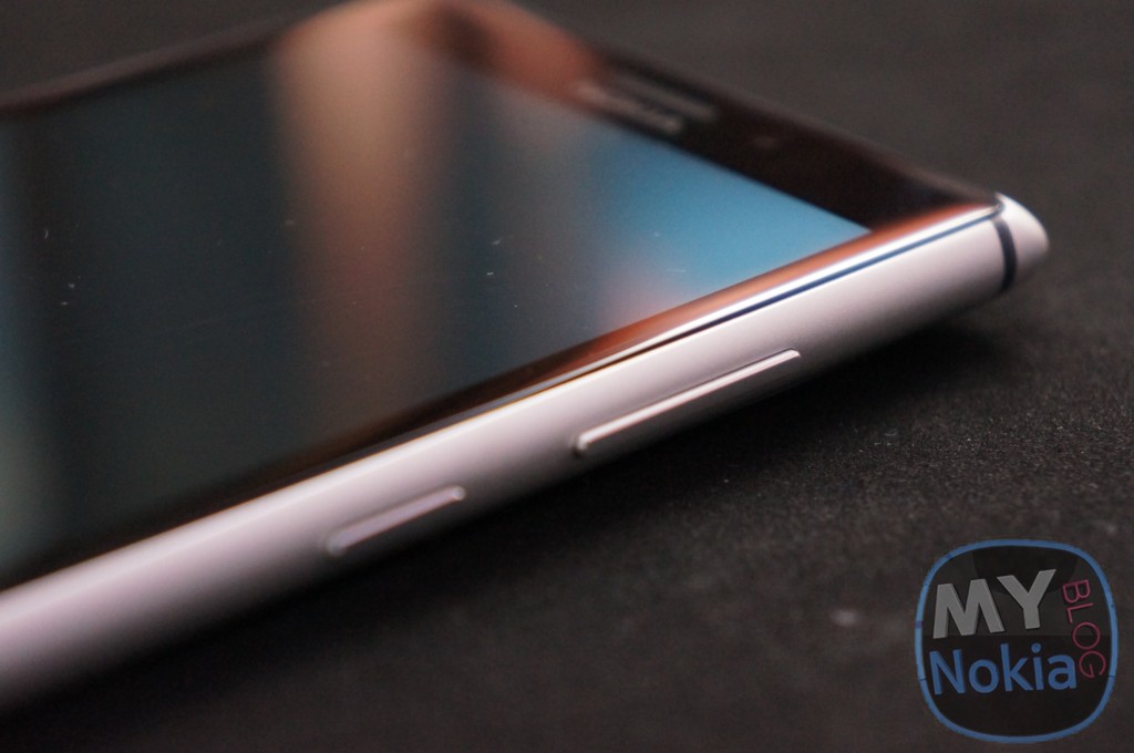
Then along came the drastic overhaul of the design with the Aluminum bodied Lumia 925. The 925 as a complete overhaul of anything “lumia-esque” bringing a whole new look to the line-up and satisfying anyone who wasn’t a fan of polycarbonate and the excess weight. Unfortunately Nokia have yet to release a second aluminum bodied phone to match the beauty of the 925’s but one can only hope.
*At this point once again notice that that the 925 builds another “look” for the Lumia family, although it isn’t overly used anyone who see’s it would know it’s a Lumia, but it doesn’t rely much on the original Fabula concept
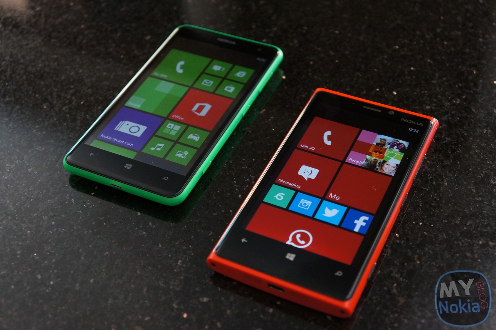
Then in July of 2013, Nokia announced the successor to the Lumia 620; the 625, which bore almost no semblance to it’s predecessor. Instead the 625 ditched the dual shot of the 620 and it’s bulkiness and came in a slim profile with all new materials and once again a fresh set of colors to spice things up again (the 625 in terms of general appearance bears the most resemblance to the Lumia 820, given the rounded soft corners and overall shape- however the new color palatte once again makes it feel like a completely new design).
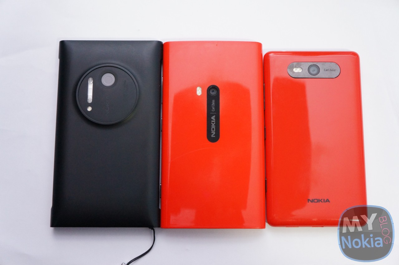
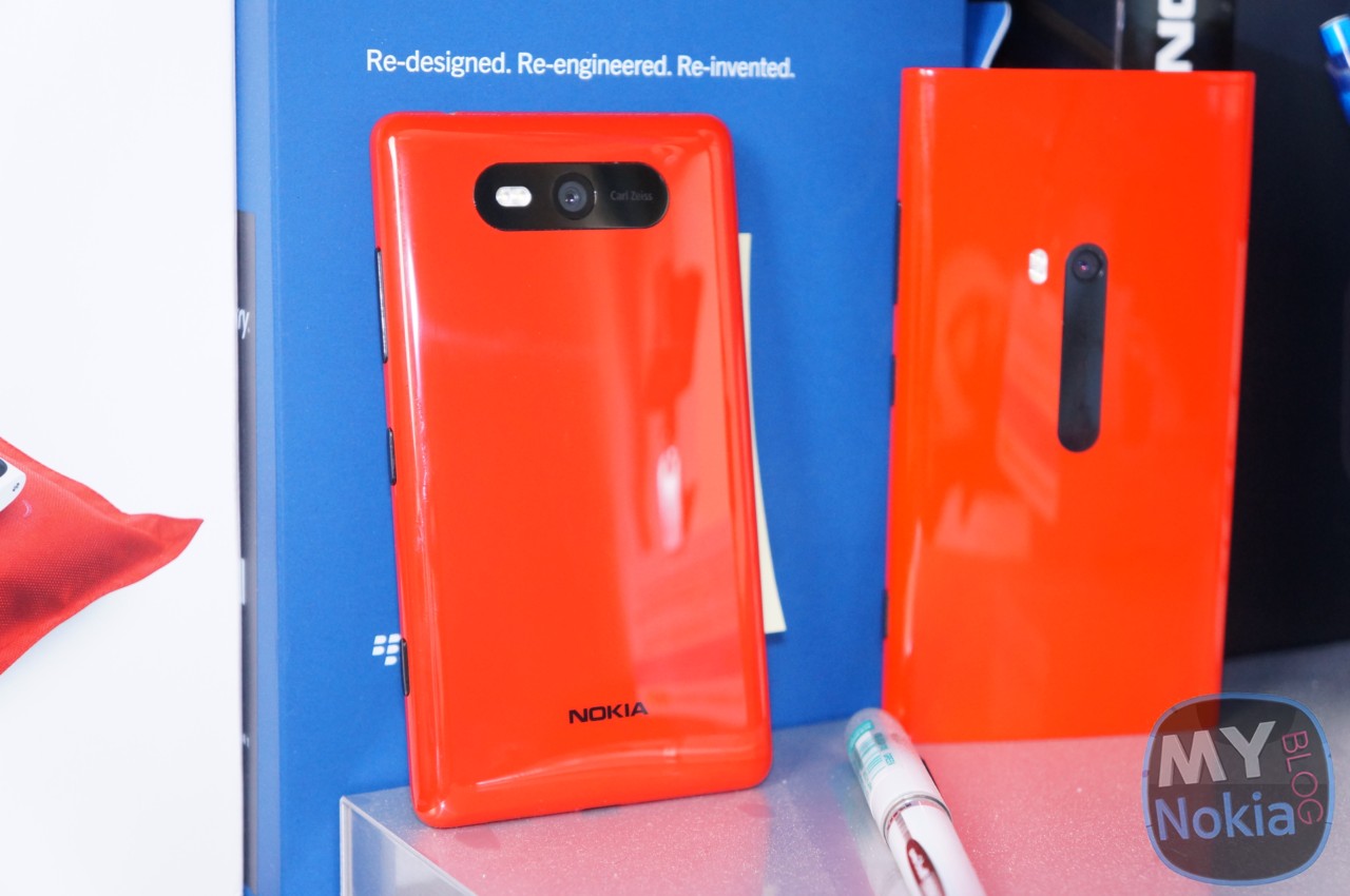
After the 635 came the much fabled, and long awaited Lumia 1020; which was almost identical in shape and dimensions to the 920, except for the fact that it had a huge camera on the back. Once again Nokia did some small refinements to the design, this time in term of colors; launching the 1020 in matte white and yellow; leaving red as the only glossy option (an overall smart decision in my opinion).
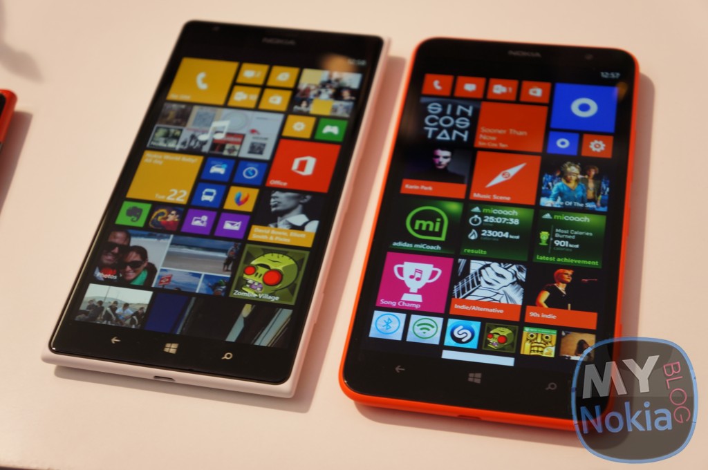
Finally after the 1020 Nokia announced the 1520 and 1320 at Nokia world late last year, both of which followed in the footsteps of one of the newer branches of the Lumia design, and not the original Fabula look. The 1520 took some obvious hints from the 925, except that it used polycarbonate once again instead of metal; while the 1320 looked almost identical to the 625, except it has a larger screen.
TL;DR:
Through our not so brief review of the Lumia lineup it’s safe to say that the Lumia look has definitely expanded past the original N9/Lumia 800, whether these designs were meant for some canned Meego devices or were freshly made for the Lumias we can not know, nor does it really matter. One thing is consistent however that the flagship devices (Lumia 800, 900 – Flagship for US, Lumia 920, Lumia1020) all have carried the same essential design language; but have been tweaked to perfection with time, all while adding and removing new colors to give them a greater appeal. On the other hand completely new designs have been introduced to the line-up such as the Lumia 620, 625, 925 and possibly even the 520; all of which can be successfully identified as Lumias by their distinct colors, or even their build materials and subtle hints; however they remain distinct devices keeping the Lumia line-up from going bland over time.
(The point of all this is just a reminder/to point out how the Lumia design has changed since the initial introduction of the N9 and then the Lumia 800; and although the design has changed they remain distinctly “Lumia” and even more importantly distinctly “Nokia”, and that alone is a feat worth appreciating.
Category: Lumia, MeeGo, Nokia, Windows Phone
About the Author (Author Profile)
Hey, my name's Ali- Currently a fifth (and final) year Dental Student from Chicago; studying in Jordan. I love all sorts of gadgets almost as much as I love my cookies! Be sure to follow my Twitter handle @AliQudsi and Subcribe to my Youtube for the latest videos - no pressure. Thanks. Since my days as a avid Nokia blogger I've completed my studies and can be found doing Oral surgery realted stuff here!!Subscribe
If you enjoyed this article, subscribe to receive more just like it.


Connect
Connect with us on the following social media platforms.