Video: Nokia Lumia 630 WP8.1 hands on
Advertisements

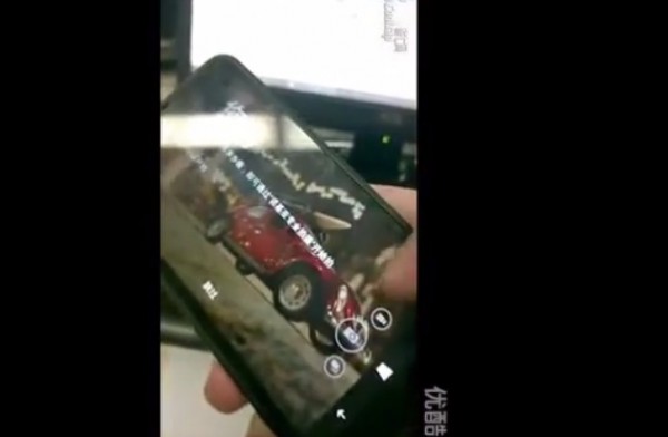
Hands on with Nokia Lumia 630, featuring WP8.1. See the pull down notification in action.
Check out the on screen buttons in action. Also, there seems to be a tutorial on how to use the WP UI.
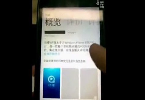
You can also see the new store in action.
I like that the app screenshots in store are now in the same page and you don’t have to swipe sideways (just downwards like the web store)

Now that the bottom is just a bar of icons, should it merely just be a bar? Should the buttons overlap the rest of the UI or appear like W8 charms? I’d like to change the button colours perhaps? Possibly add another (fourth/5th) shortcut button?
Source: WPC
Cheers Viipottaja for the tip!
Advertisements


Connect
Connect with us on the following social media platforms.