New Gallery/Photos App in WP8.1; lots of nice little welcome changes.
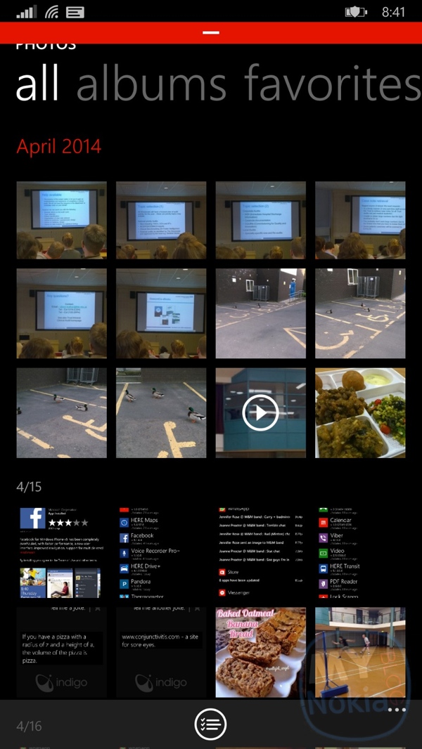
Whilst this isn’t the ‘final form’ or even, the Nokia Cyan goodness of the rumoured gallery changes, I’m a lot happier with WP8.1 vanilla’s implementation than WP8.
1) When you click on the photos tile, you are shown ALL the photos instantly. No more albums and fancy background. Â Just straight in to all your pictures including ones you’ve saved, those that were autosaved in apps like Whatsapp and screenshots.
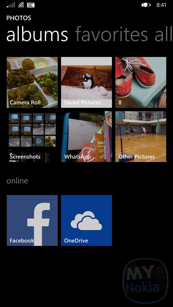
You can swipe right from the photos main view to view albums.
2) Finally, the latest pictures are shown when clicking an album pinned to the start screen. e.g. Camera Roll. It was annoying having to scroll all the way down, forcing me to either go through “photos” which would show the latest photo on top.
3) Now it’s more consistent. It shows you the latest “block” of photos, not only in terms of date but it seems in terms of when you had a little photo session. So if I took a set of pictures in the morning and then again in the afternoon and at night, they’d all be grouped together.
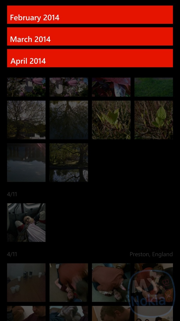
4) You no longer have to go through main photos view and then click “date”. As seen in the first screenshot, you can always see month of the pictures you’re viewing on the top left and then if you click it, it shows you all the months that have photos in (like the old photos app but now a bit more useful since it’s integrated into camera roll and photos view). It’s not there in screenshot or saved album view.
Speaking of screenshots, I needed to pin my screenshot album again as the old one brought me to albums view (Which I’m keeping too as I like that extra, possibly unintended option)
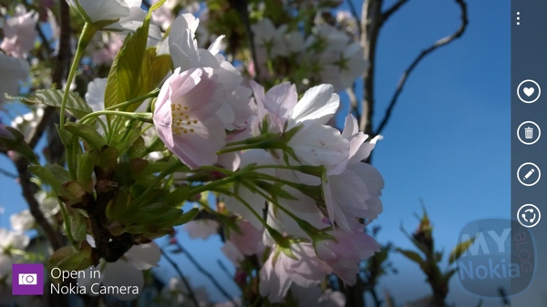
5) Clicking on any picture or going from the camera roll, no longer do you have to swipe down to view whether the picture was taken on a particular app. It shows an overlay in colour over the picture, which disappears after a few seconds so it’s not obstructing the image. It disappears also if you tap the image. Swiping between photos then won’t show any overlays (same with point 6 below).
6) The quick buttons on the right to favourite, delete, edit and share. Simple but makes it easier to use. This also disappears after a few seconds of viewing the image or if you zoom in or if you touch the screen.
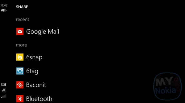
7) Speaking of sharing, just showing me the recent things I used to share helps a lot. No more swiping all the way down. Ideally as it adds more to the list when you share with more apps, something would be bumped to the top again if you use it most recently.
The icons definitely help to distinguish a fraction of a second quicker where you want to share something.
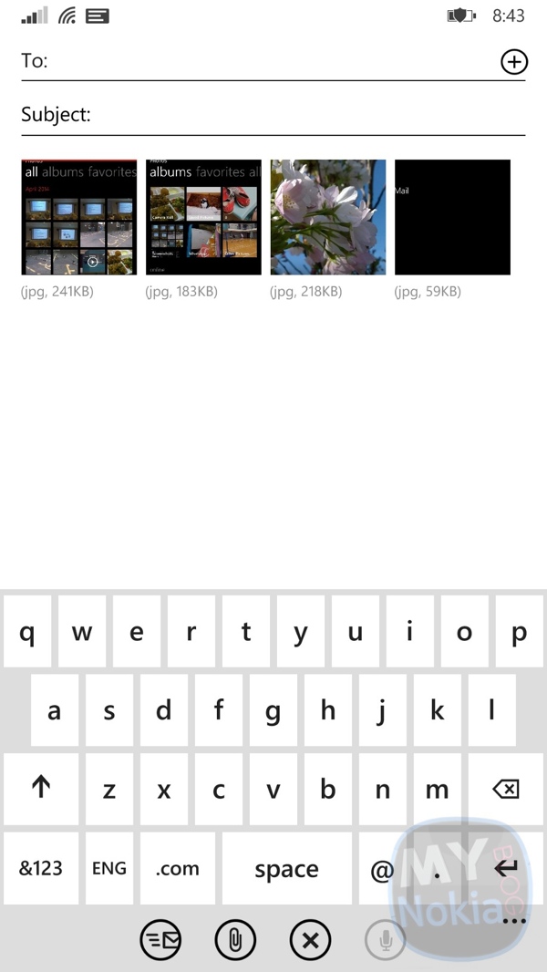
Not really part of the gallery but sharing to email looks nicer as you can now see what the images look like.
Other points:
Although there’s an option to set an image to lock screen from the Photos/Gallery app, I don’t think there is one to set the tile background.
Possibly a pinch zoom gesture on the gallery for navigation (i.e. dates/albums) or is that too iOS like?
Other than that, one of the many reasons updating to WP8.1 has been fun! Looking forward to Cyan and then the next update again 😀
Category: Lumia, Nokia, Windows Phone


Connect
Connect with us on the following social media platforms.