
Flat, Minimalistic, Rectangular, Metro Android L – Material Design attempts Microsoft’s Modern UI
Do you remember some of the critics to Metro UI on Windows Phone? Minimalistic, flat tiles was completely going against the grain. But then iOS 7 appeared borrowing quite a few elements in design. True to form, where iOS goes, Android will too. The funny thing is, WP won’t get the credit for this flatness, iOS7 will.
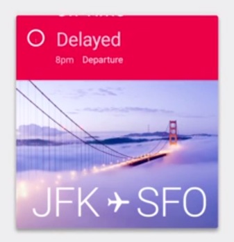
Look at the bar at the top. Very minimal, no battery % indicator. Just discrete icons.
 If anything, it strengthens Microsoft’s position rather than take away the differentiating point. Unlike perhaps say, iPhone taking the colourful uniqueness of Nokia handsets perhaps due to simply having an instant global recognition, Microsoft has already implemented modern UI in Xbox and Windows tablet/desktop.
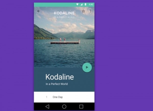
Apps are more likely to be written to suit a flatter design, a more Modern, Metro design.
Cheers Alvester for the tip!
Category: Nokia
About the Author (Author Profile)
Hey, thanks for reading my post. My name is Jay and I'm a medical student at the University of Manchester. When I can, I blog here at mynokiablog.com and tweet now and again @jaymontano. We also have a twitter and facebook accounts @mynokiablog and  Facebook.com/mynokiablog. Check out the tips, guides and rules for commenting >>click<< Contact us at tips(@)mynokiablog.com or email me directly on jay[at]mynokiablog.comSubscribe
If you enjoyed this article, subscribe to receive more just like it.


Connect
Connect with us on the following social media platforms.