
Windows Phone 10 UI Screenshot concepts
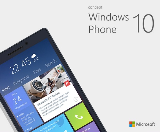
Check out this new concept UI for Windows (phone) 10.
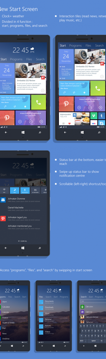
I like it! There’s the usual tile interface but now with a background. The bigger change is the persistent tabs on on that show the start, programmes (essentially the same) but then a file browser and search function (which somewhat does what the old search button can do).
Note that the status bar is at the bottom.Whilst I like the thought of an up-swipe bringing me the notifications, I am concerned with a) the buttons at the bottom b) the other on screen buttons – made worse if there’s a mix of bottom based tool bars and on screen windowsphone keys.
They’ve made some other changes to the store, music app and lock screen. I think those don’t need changing.
Although when the search bit appears, I think it should show the recently installed apps.
Source: Behance
Cheers Alvester for the tip!
Category: Windows Phone
About the Author (Author Profile)
Hey, thanks for reading my post. My name is Jay and I'm a medical student at the University of Manchester. When I can, I blog here at mynokiablog.com and tweet now and again @jaymontano. We also have a twitter and facebook accounts @mynokiablog and  Facebook.com/mynokiablog. Check out the tips, guides and rules for commenting >>click<< Contact us at tips(@)mynokiablog.com or email me directly on jay[at]mynokiablog.comSubscribe
If you enjoyed this article, subscribe to receive more just like it.


Connect
Connect with us on the following social media platforms.