
Reddit FTFY Nokia 3310 – Is this what you were expecting from the redo?
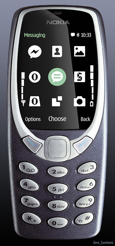
Some of you wanted the new Nokia 3310 too have a more classic look.
This is pretty strictly, the Nokia 3310. Â You can see that the design of the original seems to leave space for a tall portrait display.
What I like in the render is the black and white theme and the splash of that green. It’s very reminiscent of the monochrome display and is less like a 150 in a pseudo 3310 suit.
I’m not sure why they couldn’t keep the original placement of the menu buttons.

Also, I miss that top power button. It’s easily accessible 🙂
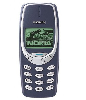
Here’s the real ‘new’ Nokia 3310.
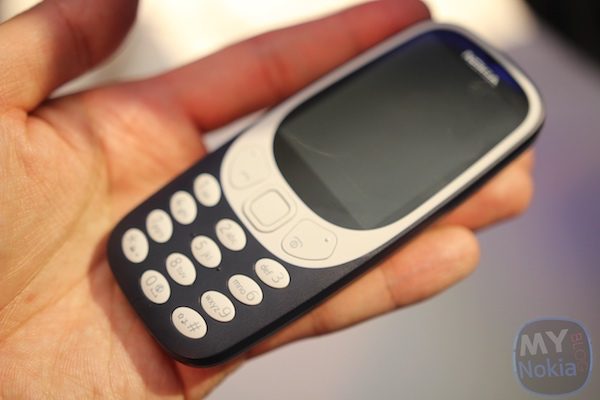
Imagine the battery capacity if we kept the thickness :p
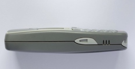
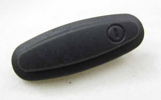
What was that thing on the side of the 3310 – what’s the little notch there?
Via Reddit
Category: Nokia
About the Author (Author Profile)
Hey, thanks for reading my post. My name is Jay and I'm a medical student at the University of Manchester. When I can, I blog here at mynokiablog.com and tweet now and again @jaymontano. We also have a twitter and facebook accounts @mynokiablog and  Facebook.com/mynokiablog. Check out the tips, guides and rules for commenting >>click<< Contact us at tips(@)mynokiablog.com or email me directly on jay[at]mynokiablog.comSubscribe
If you enjoyed this article, subscribe to receive more just like it.


Connect
Connect with us on the following social media platforms.