Medley of Concept Awesomeness! Nokia MeeGo Tablet, Windows Phone Tablet, Windows Phone 7 new homescreen/multitasking remix
Lets switch to something a little more positive. It’s a Friday!
If there is one link you should visit today, it’s this:
http://jozefkocur.blogspot.com
I came across it after @VHaho tweeted about a WP7/WP8 tablet concept. But the site has so many other tantilizing designs!
The designer is Jozef Kocur. He’s a high school student due to graduate in 2012 from Slovakia, but temporarily living in the US. A high-school student made these.
They were going to be in separate posts, but since we’re discussing all the same subject, I think it’s best to keep that in here.
This is what we’ll cover – each of which I would have been worthy of their own post. This maybe too much awesomeness.
- MeeGo Tablet Concept
- Windows Phone Tablet Concept
- Windows Phone Home Homescreen transparency and wallpaper
- Windows Phone additional homescreen panel
- Windows Phone Multitasking and control panel concept
It’s a long post. I tried putting in Jump tags to make it easier to navigate but wordpress being the pain that it is, the WP.COm jump tag code does not work.
1. MeeGo Tablet
This is a Nokia MeeGo tablet design. We have here a landscape focused tablet (see position of camera). It looks nice, no?
Jozef has also redesigned the UI, with a panoramic interface you’ll see echoed in his Windows Phone Tablet.
2. Windows Phone Tablet!
Windows hasn’t really taken off on tablet. They’re out there but they’re not too finger friendly. Supposedly in W8/WP8 it’ll be tablet friendly.
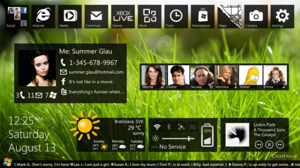
As you see this design takes cues from Windows Phone 7 featuring a tiled top bar, widgets, contact bars and contact info. You’ll see this in earlier designs.
 Given Windows Phone 7’s panoramic interface, it seems already fit for a device with a big, long screen.
 So this is what you’ll see in Jozef’s design, though not simply just putting Windows Phone inside a tablet. This is redesigned for the bigger screen.
You’ll see on the very left the initial Zune Player start screen with a top grid separating that particular option, e.g. Pictures on Left, Albums/Camera Roll etc on top. So Music on left, Songs/Artist/Albums etc on top. This is brilliant! Makes use of the real estate and makes everything super quick to access!
 Here’s internet explorer on the tablet. There’s the tabbed/Windows view. I hope it can play flash. Seems to be able to in here (at least it seems to load flash objects).
 Will Nokia make a tablet on MeeGo or Windows?
Will it be enough to take on iPad/iPad 2? Xoom doesn’t seem to be getting that much love.
3. Windows Phone Home Homescreen transparency and wallpaper
Now, when we saw some Nokia Customization Concept of Windows Phone there was backlash from a few members of Windows Phone community (yes, they do exist) who found it and was very adverse to all the changes to their delightful metro.
Well, this isn’t too much of a change right? It’s so simple but I think it really works. It just adds transparency to the tile, but gives you your own background wallpaper.
There may be some issues that the transparency/contrast has to be just right so that the wallpaper doesn’t make the tile information unreadable.
4. Windows Phone additional homescreen panel
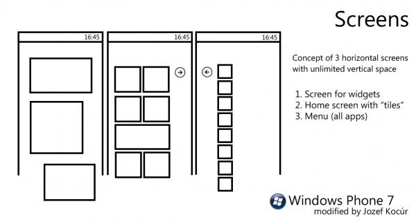
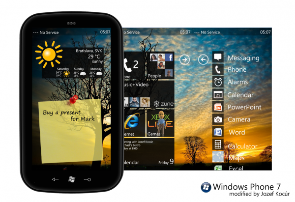
OK, this may be a bit of a bigger change, though it doesn’t drastically change the current Windows Phone UI. All it does is add a 3rd homescreen for WIDGETS!
This says modified by…is there an original concept from somewhere else?
 This is how it looks. We’ve got the usual Windows Phone stuff in the middle and the right (though with custom wallpaper).
On the left, you’ve got the widget panel. These are free form widget that can be any size.
 This is how it would appear on the phone. Windows Phone evangelists – does this take away from Windows Phone’s Metro principles?
5. Windows Phone Multitasking and control panel concept
- http://jozefkocur.blogspot.com/2010/07/wp7-multitasking.html
- http://jozefkocur.blogspot.com/2010/07/wp7-control-panel.html
Finally to complete this bonanza…
This multitasking interface was produced before Windows Phone handsets were available. We now know that Windows Phone 7 will implement a Symbian^3/webOS horizontal page multitasking. Below you see multitasking in grid form. I prefer this because you can fit more into a screen.
Maemo 5 had multitasking, both handling and the UI perfect! LIVE Contextual sized windows in growing grids the more apps you multitask. Not Icons. Not screenshots. Not endless swiping.
MeeGo went a similar step, blending Symbian^3’s linear swiping multitasking interface and with a pinch zoom switch to grid view.
 OK, before I disappear again for the day this is the control panel drop down menu. This is something I’ve been treated to on the N800 and N900 having these options easily available at my finger tips from the main menu. You could say drop down from Android too. But this has been on Nokia well before Android even existed.
- WiFi/3G/Bluetooth on/off switch
- Brightness controls (damn this is so frikkin missed from N900. I hate waking up in the morning and that crazy Super AMOLED screen killing my eyes. N8 less bad as it has an over zealous light sensor, plus a quick low power mode)
- Volume controls
- Meaningful battery indicator. The current battery indicator on Windows Phone is a little meaningless stub.
Are any of these designs anything you’d look forward to? Any Windows Phone purist happy about the additional homescreen page, transparent tiles/wallaper or status/control panel bar? These are pretty much things Nokia users have been used to and may come to expect (though there will still be those that just dislike the whole Windows Phone party)
Category: Concept, Dream Nokia, Maemo, MeeGo, Nokia, Nseries, Rant, Symbian, Windows Phone


Connect
Connect with us on the following social media platforms.