Nokia Sabre shows up again, with bumpy WP buttons
Yesterday, John posted a picture of the Nokia Sabre, spotted at pocketnow.
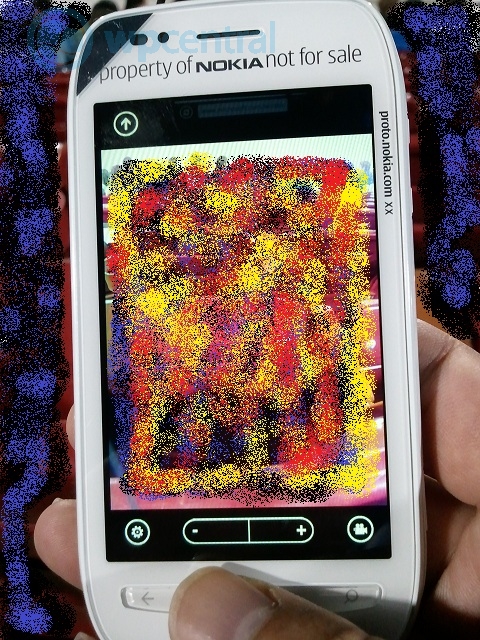
Now at WPcentral is another picture, this time showing the Windows Phone physical buttons, with Back and Search visible (and Windows Button covered up by the thumb).
This should prevent those rather annoying mis-presses of the capacitive keys (namely, inappropriate launch of bing search)
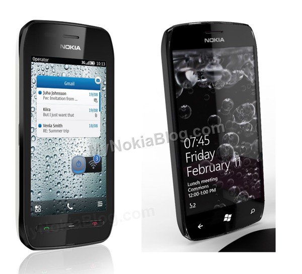
Note that with these buttons it looks even more like the Nokia 603, which to begin with already looked like that concept Windows Phone from Nokia.
WP Central notes a possible lack of front camera since there is no switch in camera mode. I hope there is one, what with Skype video and Tango video to become prominent soon.
I’m severely disliking the presence of non full screen viewfinder. I think the camera UI of Windows Phone sucks! It freaking sucks! It hasn’t improved that much in Mango either. I don’t want something like the Symbian Camera UI though, I much prefer what Nokia did with the N9. Everything is so easy to get to.
The only thing I really like in the camera is that you can easily swipe left to view your gallery.

Source: WPCentral
Cheers, Glenn, RaV, KF and Ian for the tip!
Category: Nokia, Windows Phone


Connect
Connect with us on the following social media platforms.