Weekend Read: Nokia Concept UIs Revisited (from 2006)
I remember writing about this video, already reminiscing the fact that in 2006 (and possibly even before that) Nokia knew precisely what touch interfaces should look like. Yet for some reason, we got lumbered with S60 which doomed us all (Note, not Symbian, but S60).
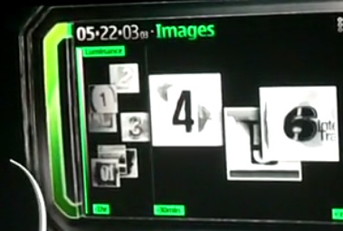
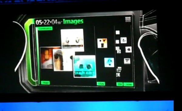
Look at the little gallery view think. That’s a little like the widget on Belle FP1 right? This one actually looks more dynamic.
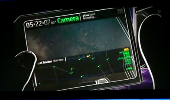
The phone uses the camera, GPS, and accelerometer (possibly even gyro) to have augmented reality star viewing. We take this kind of thing for granted now but back in 2006 that would be witchcraft.
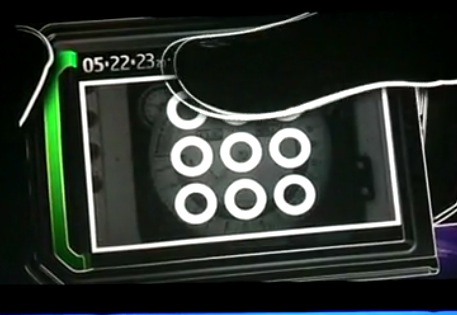
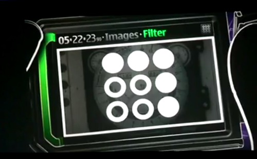
Look at this lock screen interface. Before swipe to unlock. Before iPhone existed. Before Android existed.
It was also interesting how they brought this interaction up.
How is it that Nokia can come up with such amazing ideas but we never see Nokia implement them? Or at least someone else becomes famous for it?
Remember the lock screen – the active lock screen where you can interact with things within the lock screen?
Already filed in 2007.
Lastly, the most obvious thing but overlooked.
This touch interface is very thumb friendly. There’s no keyboard. There’s no buttons. Such a thing was laughable when the iPhone was going to try this. No stylus too. But Nokia’s already there.
Imagine what could have been if Nokia would have let the world’s most creative and talented minds turn these concepts into reality.
Category: Nokia



Connect
Connect with us on the following social media platforms.