Thickness comparison: Nokia Lumia 920 versus the slimmer, lighter Nokia Lumia 925
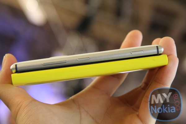
Whilst the Nokia Lumia 920 was praised for plentiful innovations and beautiful design, the main qualms by some were thickness and weight. The Nokia Lumia 925 addressed this by improving further on certain innovations (like camera, screen) whilst making it slimmer and lighter.
Now I didn’t mind the 920’s weight but others obviously did. The Nokia Lumia 925 felt noticably lighter and the slimmer frame made it somewhat nicer to hold in the hand (depends on the person really).
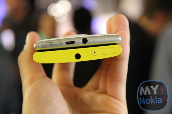
Whilst the back was polycarbonate, the frame of the 925 is anodised aluminium.
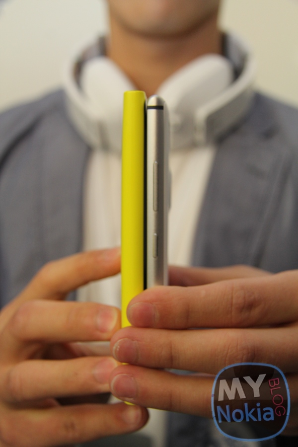
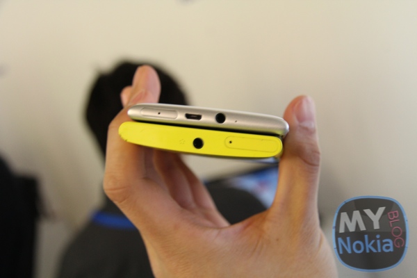
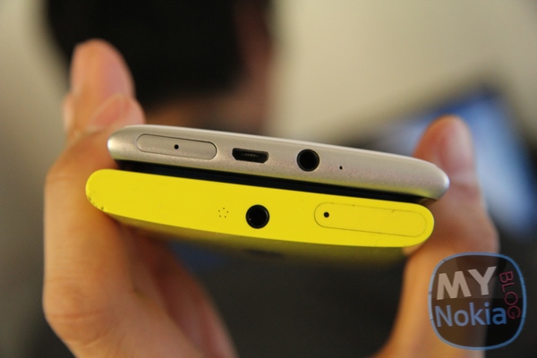
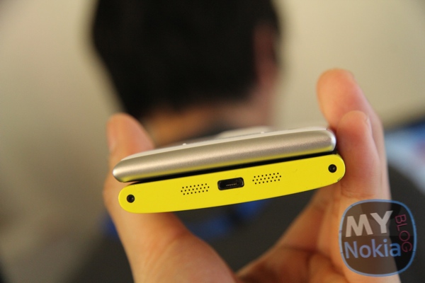
The 925 is visibly slimmer in comparison. Note also the lack of ports at the bottom as Nokia apparently wanted clean sides for the left and bottom (though it was thought that it was a design guideline for new WP8 to have charging ports at the bottom) Well if it means being able to squeeze things in differently to make it slimmer, why not.
The phrase Nokia liked to use was “volumetric thickness of 8.5mm”.
Perhaps making an even more tapered design would further add to the illusion of being slim. (Like the macbook air)



Connect
Connect with us on the following social media platforms.