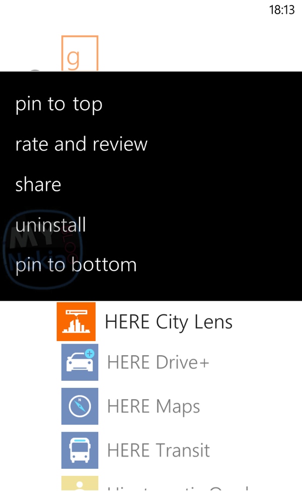
MNBRG: Idea: Pin to Bottom, Pin to Top for start screen Live Tiles.
Advertisements

We got a nice email from Erick who shared the screenshot above. As you know pinning things to the start screen was the essence of WP. Erick has an idea
Hey, Jay!!
ÂBig fan writes you from Ecuador. This wont be a long one: Have you noticed when you have pinned more than 10 apps to the homescreen of your Windows Phone it becomes really tiring the fact that if you want to pin more apps, when done, they go straight to the bottom of the homescreen? Usually, the bottom isn’t the ideal place for that certain app. Sometimes is waaaay back to to the top!!!! What is left for us to do? Drag the app to throughout the whoooole homescreen in order to place it in the right place.My idea (don’t know if someone has already proposed it….) is very straight forward. I’ll leave you a file with a picture which is sefl explanatory. If wouldn’t be too much to ask, help me promote it please.ÂThank you very much
Erick Bonilla Avila
Moving tiles could also be quicker if you had a scroll bar on the side that you could drag. Or even give us some semantic zoom so that in makes scrolling more convenient instead of scroll/scroll/scroll if you have lot of tiles. Thankfully the 3 column (6 mini column) capability of the 1520 and co makes scrolling less of a thing now regarding tiles. There’s about 7 homescreens worth in the first view (7 compared to how much WP7 could show). It only takes me two swipes to get to the bottom vs well, much more on the 1020 and forever on the 800.
Chers Erick for the tip!
Advertisements
Category: Concept, Lumia, Nokia, Windows Phone


Connect
Connect with us on the following social media platforms.