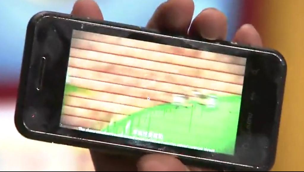
First glimpse of MeeGo Phone! Circule icon apps, Android like buttons and 16:9 screen.
Very quickly following today’s previous post, I’ve separated this one as it takes a closer look at the MeeGo phone from the video.
Remember yesterday those MeeGo screenshots in 16:9? Well here’s a look on what could possibly be the or at least a basic standard of what MeeGo phones will look like. [Note, it’s not like the Intel Moorsetown LG phone – screen is much longer]
First: The phone looks to be a cross between iPhone and a keyboardless N97 mini.
Second: Check out that bar at the top, like yesterday’s screenshots.
Next: Check out the App icons – they’re circular, simple and flat…hmm…
APP ICONS
Note, dedicated camera button.
Main screen BUTTONS
Take a look at the front face buttons. They look straight out of android with the Home button, menu, back button and search! [No call/end 🙁 ]
This isn’t some android phone running MeeGo right?
That’s awesome that we get a homescreen button to get to desktop and a menu button for the apps. That’s what I’ve been dying for on Maemo (at least a touch version as we can’t add physical buttons to the N900:P)as the current menu/desktop/multitask interface, despite it actually being really useful, confused a lot of people used to more obvious solutions.
These buttons are flush with the screen and look to be touch sensitive. Good going there. And no they’re not part of the touch screen if you look at the third image during video playback.
These buttons are very useful. I loved the back button on old Symbian and it disappeared. On Maemo 5 the menu button disappeared.
Here, it’s easier to see the ratio of the screen looks to be more around 16:9.
Also the screen size here looks to be at least 3.5″. Possibly 3.7″.
It looks as though that like the N900, N97 and N97 mini, the bezel is slightly raised again and NOT flush with the screen. I hope it’s not like this in Nokia’s first MeeGo phone. 


Connect
Connect with us on the following social media platforms.