(Tablet?) MeeGo Touch UI. More Screenshots – MeeGo looking Great! 1366×768
This morning we looked at some MeeGo screenshots seen in the N9 teaser.
Jim found the UI component guidelines for MeeGo 1.2 released yesterday. Inside were some lovely screenshots which are included in this post about the new MeeGo UI. It looks great!
But before I go onto that, the aspect ratio kinda bugged me. It plainly looks 4:3 right? And then I saw this:
MeeGo Touch is designed for Intel Atom processors with 1gb of
RAM and a multi touch screen of 4-10â€. The primary orientation for
4-7†is portrait, and landscape for 10†and over.
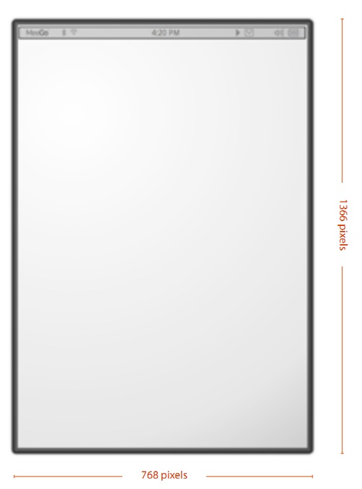 1366×728! The diagram might not be exactly representative although it is pixel wise 16:9.
I’m guessing 1366×728 is for tablets and it would rescale perhaps to 960X540 or even 800×450?The Hardware home button requirement might confirm Tablet since I’m sure MeeGo handset front is buttonless.
Anyways, these below are more official Vanilla MeeGo Screenshots (Nokia’s could be quite different)
This is the panels MeeGo we saw before. It was exciting the first time we saw it but then we didn’t see much progress.
 But what’s a 4″ tablet? Is that a phone? Is this design for smartphone/handset MeeGo too? A lot of the elements here are portrait thus within the 4-7″ category (could be a 7″ tablet?)
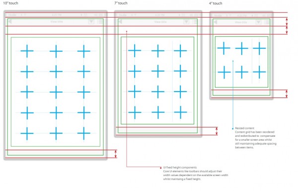
Resizing is addressed below:
There’s strict instructions not to simply squeeze a lot of information into a smaller space.
All functional toolbars are UI fixed height elements and as such should only be resized horizontaly.
Safe areas are indicators only, be careful of not attempting to ‘squeeze’ the same amount of content into a smaller space.
Reordering and redistribution of content items provides the most effective way of resizing.
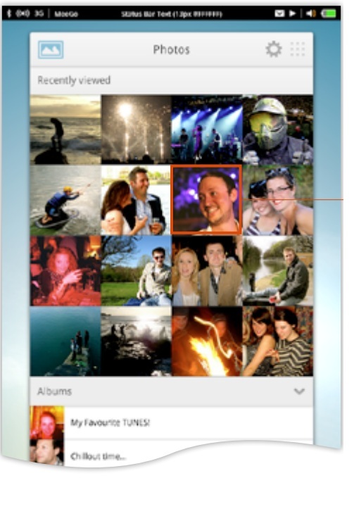
Below is Gallery. It looks like MeeGo we’ve seen before. The status bar is somewhat different as the battery is on the left side.
Gallery Albums look.
Recently viewed photos with albums listed below
This is the music player view. Navigation at the top, album art in between, songs at the bottom.
That is absolutely PERFECT!
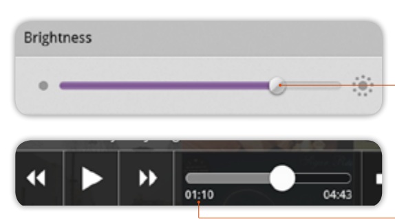
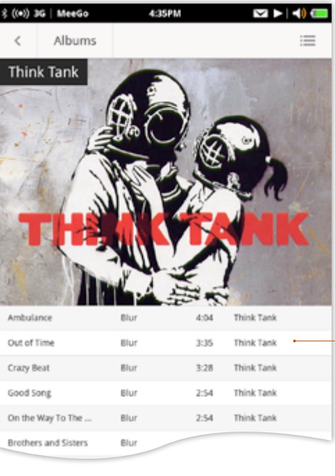 Brightness button and Video player controls
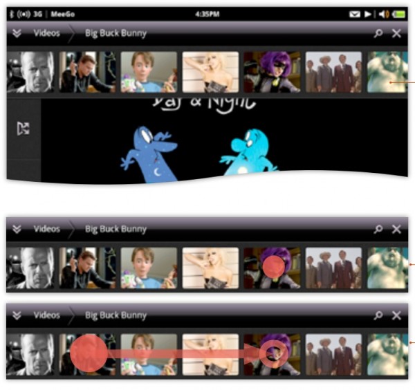
Tile preview in video player.
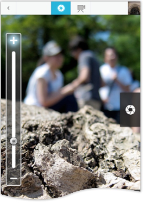
Camera UI.
Camera and Video buttons on top. SETTINGS on side. With quick flash on/off.
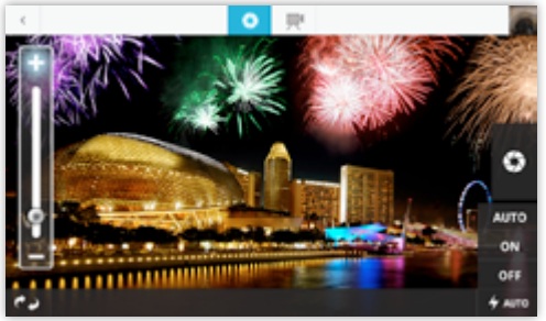 Very interesting. Alternative portrait view for camera UI.
Text editor looks a lot more functional than OFFICE on my Windows Phone. It even has spell check! Copy and paste obviously there already.
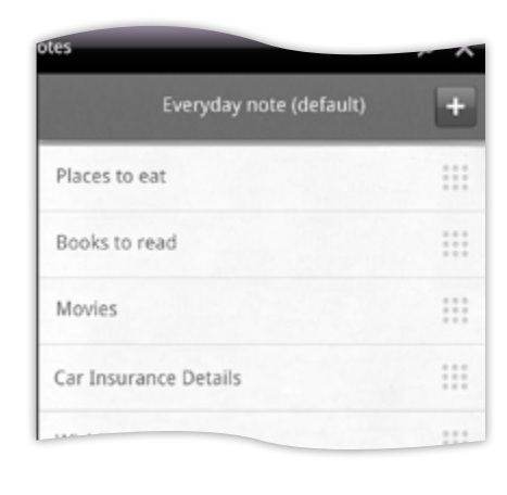
Notes
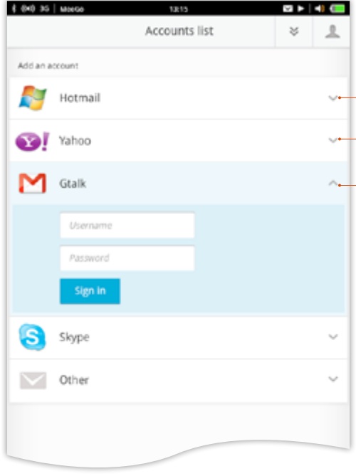
Video Calling via Google Talk
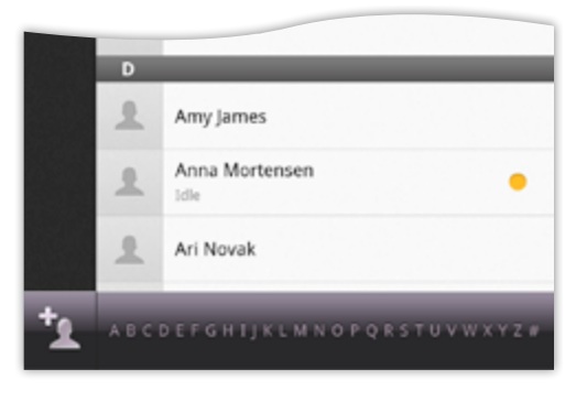
Phone Book This is much easier than Microsoft’s silly alphabetical order letters (which Nokia also tried on Symbian). Give me scrollable letters list or search.
Bluetooth – it accepts BT mouse!
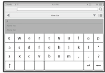
Keyboard looks kinda different
The document these came in wasn’t there to show the core apps, but show the design principles in how things interact – with core apps as examples.
https://meego.com/sites/all/files/users/admin/meego_touch_ui_v1.2.pdf
Category: Nokia







Connect
Connect with us on the following social media platforms.