Gallery: Nokia N9 UI screenshots
The bulk of Nokia N9 information can be seen at the post about its official announcement.
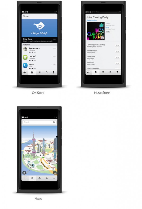
Here I wanted to take a closer look at MeeGo Harmattan 1.2 with these screenshots taken from the N9 UX guidelines. Note, a very important part we won’t get from looking at screenshots is the fluidity/motion/gestures that enhance the user experience greatly.
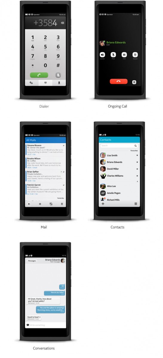
Communications – dialler, calling, mail, contacts.
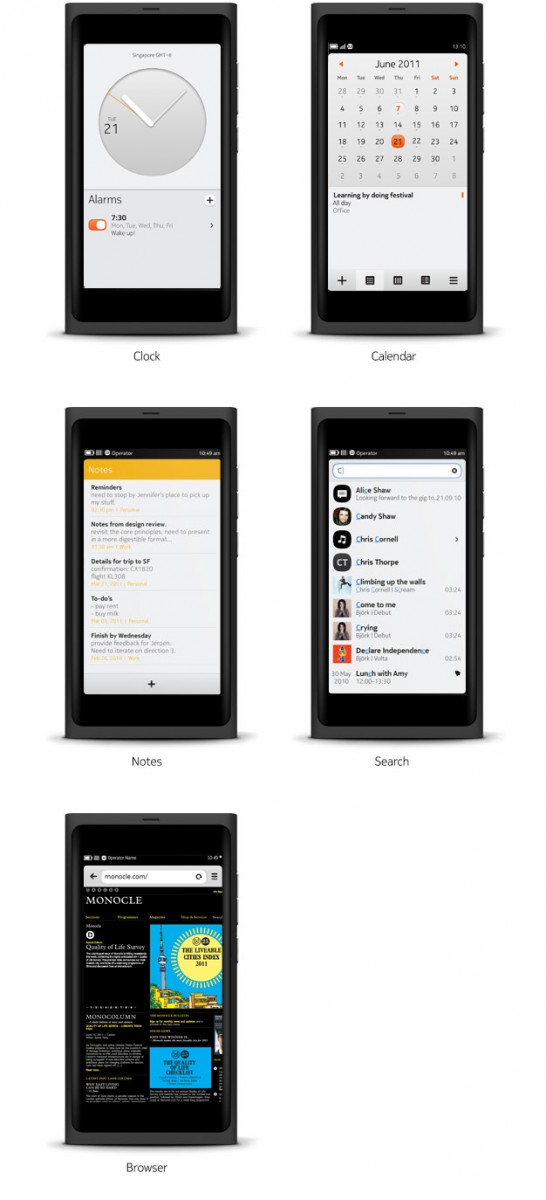
Productivity/office stuff. I liked the curved corners of the apps, very pre/webOS
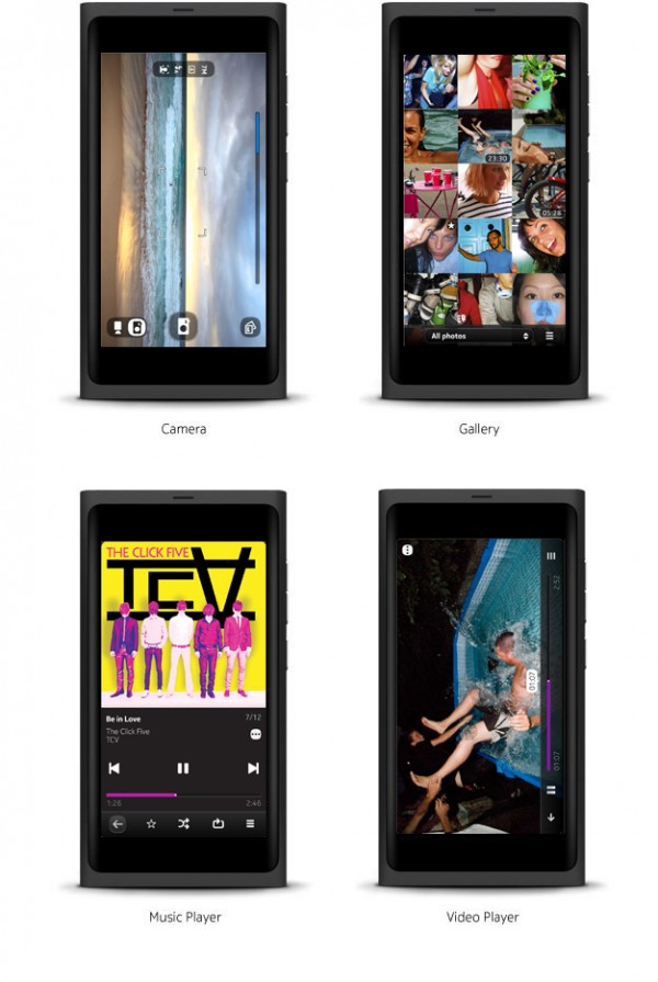
Media things: Camera, Gallery, video player. Camera looks nice and simplified for touch. Look at the button placements on left and right sides.
Music player looks great, big album art, music player controls with quick favourite/replay/shuffle. I think I would have also liked possibly tabs/breadcrumbs (like in the music store).
It’s still called Ovi Store as transition hasn’t completed yet to Nokia Store. 
Cheers for the tips folks. My Twitter stream is lost with so many tweets so I can’t find who linked this to us but thanks nonetheless.
Category: MeeGo


Connect
Connect with us on the following social media platforms.