Gallery: Nokia N9 vs N950 vs N900 vs E7 vs Samsung SGSII vs iPhone 4
Inspired by yesterday’s N9 comparison gallery, Gavcio has found another fantastic set of pictures of the newly announced MeeGo-Harmattan Nokia N9 and Nokia N950 compared with some iconic handsets. The huuuuge gallery is available at
http://hi-tech.mail.ru/review/misc/Nokia_N9-prev.html
Here are my top 10 favourite shots from their gallery.
First and foremost, the default comparison – with the iPhone 4.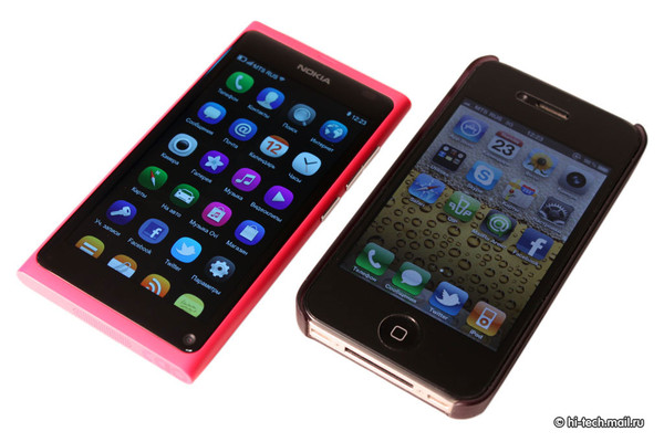 This one versus the Android beast that is the Samsung SGS II. I think the black N9 shows off the design a little bit more than the wilder blue and pink ‘toy’ colour choices.
The black matte polycarbonate makes the N9 look like it’s sort of covered in velvet.


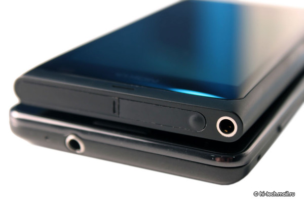 OK now versus the Nokia E7. Who’s rocking those Anna icons better? A better comparison maybe perhaps with the N950 vs E7 no? N9 for me – it looks like a scrumptious handful of skittles. Taste the rainbow!
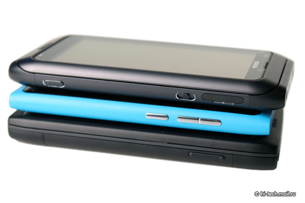
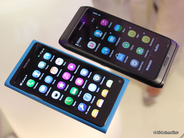 OK. A E7 sandwich of MeeGo buns.
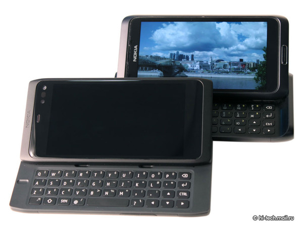
Keyboards (if E7 was in English) would be identical.
This one tugs at the heart strings. Hello N900. Had plans been executed as expected, we’d be calling that thing on the left N9, successor to the N900 and we’d actually be looking for the third family member, the 2011 successor to N9.
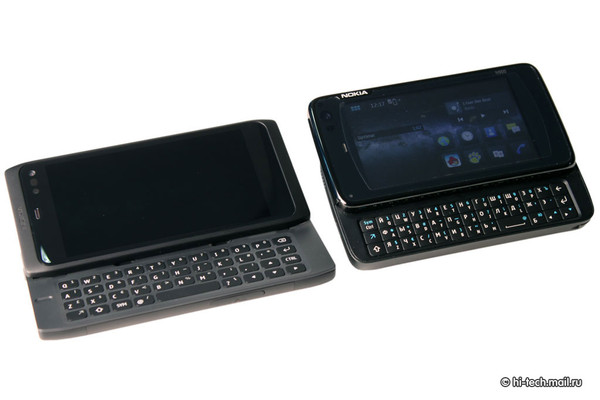 Crickey, look at how much weight has been lost. N900 was a monster, and that massive heft was the only thing really that put off reviewers.
This is NOT a pink N9. This is actually a BLUE N9 in a pink case.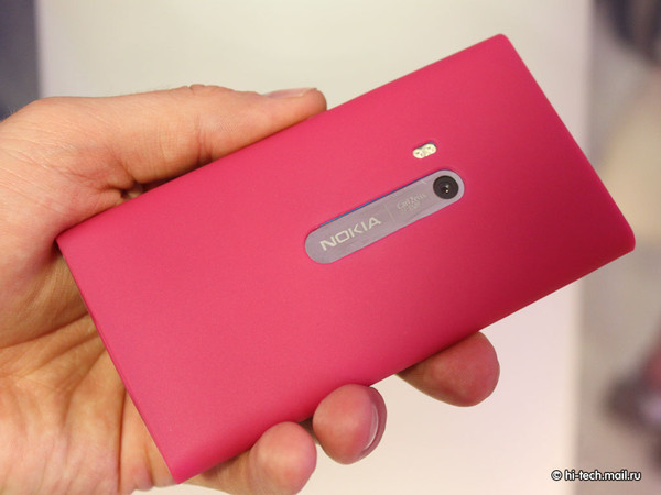 SOURCE: hi-tech.mail.ru
Category: Nokia



Connect
Connect with us on the following social media platforms.