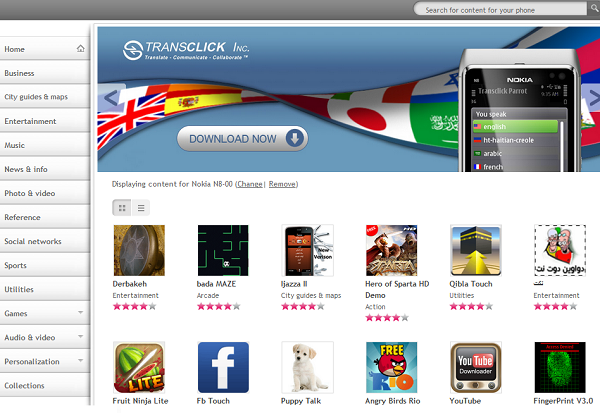
Updated Nokia Store Look + Increase in Download Limit.
If you head over to http://store.nokia.com/ you’ll find that there’s been a couple changes to the layout, mainly moving all the categories to left side of the screen rather than having them cluttered up below the featured app. This new design does make it much simpler to navigate through the site and gives it a more professional look. However I can’t help but feel it looks quite a bit like the Android Market where the categories are on the left along with a bunch of ‘featured apps’ showing up alongside.
One thing I expected to see was a change to the new “Nokia Blue Color” that seems to have taken over all Nokia sites as well as their phone boxes, future changes I guess? Or maybe Nokia Store will get the ‘Metro UI’ treatment just like Nokia Conversations?
Another new change is the Re-Download limit policy for paid apps, Nokia original limit was a measly 3 times per account/purchase after which you’d have to purchase the app again. This was extremely annoying for those of us who constantly flashed and updated their phones and had to download the apps again. Later on Nokia upped the limit to 5, and just last week it’s been upped once again to Ten Re-Downloads before having to purchase again, basically that gives us a bit more flexibility when it comes to hard-resetting our phones or flashing them; no fear of losing our beloved Gravity.
Category: Applications, Nokia, OVI


Connect
Connect with us on the following social media platforms.