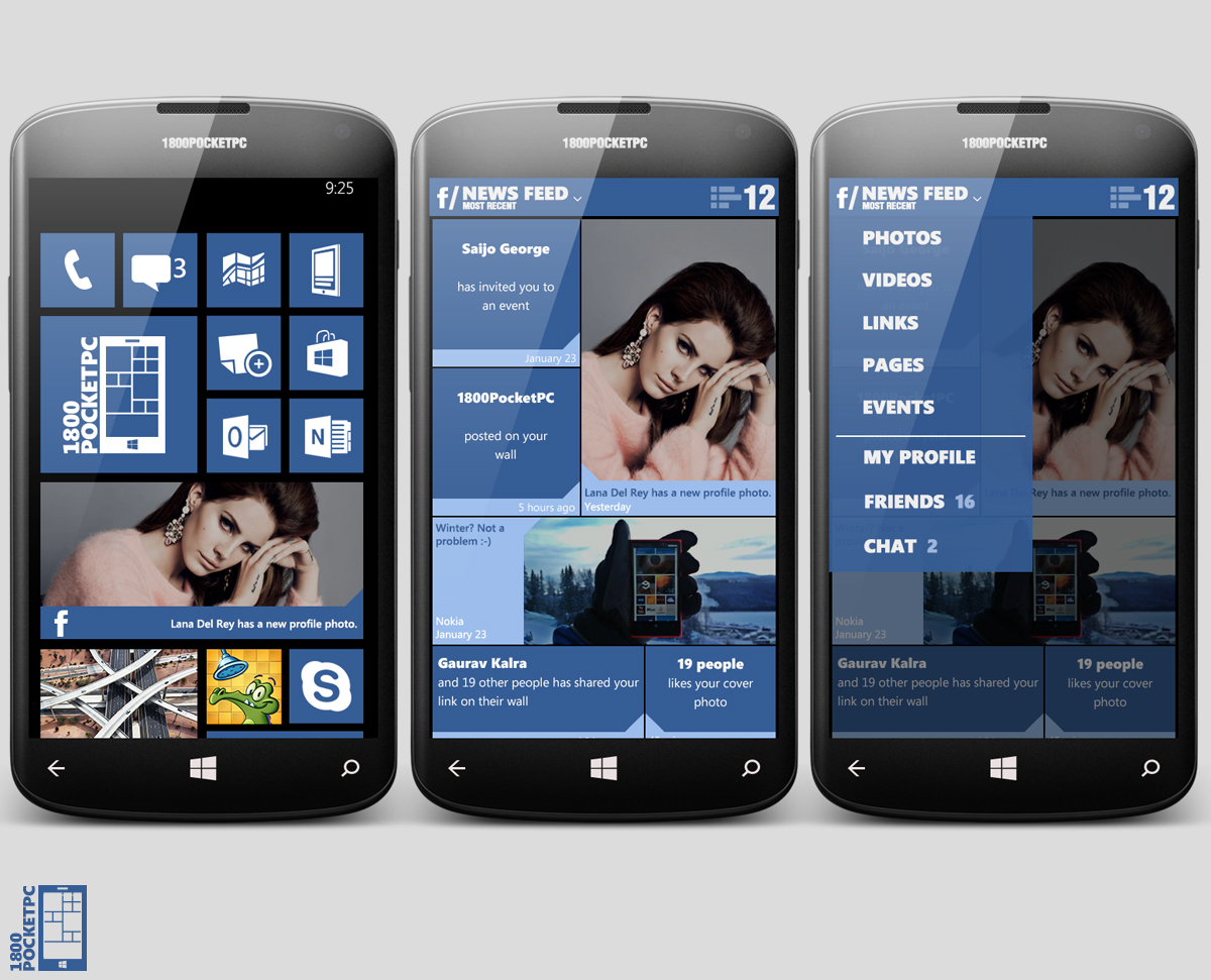
Redesigned Facebook For Windows Phone Concept
 Personally I have no qualms with the current Facebook app for Windows Phone; besides the fact that it’s sometimes confusing whether pressing the back button one more time will end the app or take you to your Facebook feed. But the folks at 1800PocketPC went ahead and conjured up a redesigned version of the Facebook app; it looks pretty “metro” although personally  I’m not a big fan of the blue overdose (especially since most of Facebook is white now).
The coolest design feature however is the inclusion of the charms bar from Windows 8/Windows RT into the app; I’d love to see that included into Windows Phone all over the OS.

Category: Applications, Lumia, Nokia, Windows Phone


Connect
Connect with us on the following social media platforms.