WP8 UI concepts: folders, 3/4 length tiles, menu notifications…
Advertisements
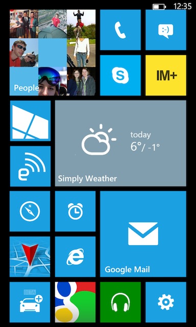
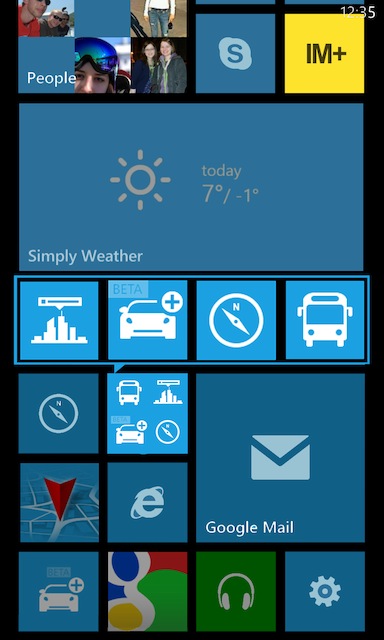
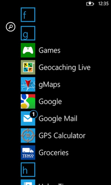
Some interesting concepts suggested by jonathonpm on TheVerge forums.
- 3X2 or 3/4 length tile. Big enough to have extra information but still having space for a couple of tiles
- Folders. One tile that expands other tiles outwards. A little bit like the Grid10 phone (oh dear – saying Oh Dear more because of Grid10 and the confusion that it might have been Nokia)
- Notifications in the app menu – so they’re kinda like live tiles in a way too, not just at the homescreen.
- Something else I hadn’t considered before – pinning letters. I’d like to have the option to pin ANYTHING. E.G. A photo or a video. I remember my 7610 had that option (though it was in the ‘go to’ folder – nice quick access)
Via: Reddit
Advertisements


Connect
Connect with us on the following social media platforms.