Weekend Read: New set of WP8.1 UI concepts
Advertisements
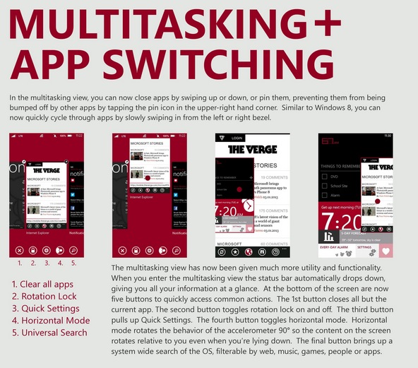
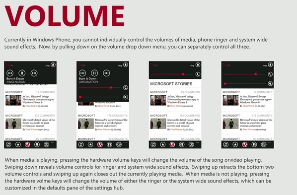
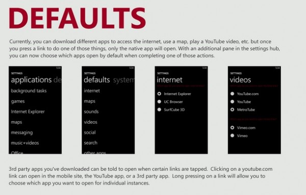
Above you’ll see a long stitched image of some WP8.1 UI concepts. Explanations are all in the image. http://i.imgur.com/0WdDvqz.jpg or as separate images here.
It even contains similar notification arrangements as demoed by our very own Peter L, with some added task switching functionality too for the multitask view.
We can but only hope MS is working on continually improving the WP UI so that our Nokia Lumias are as strong on software as Nokia makes them in hardware.
Via: Reddit
Advertisements
Category: Concept, Lumia, Nokia, Windows Phone


Connect
Connect with us on the following social media platforms.