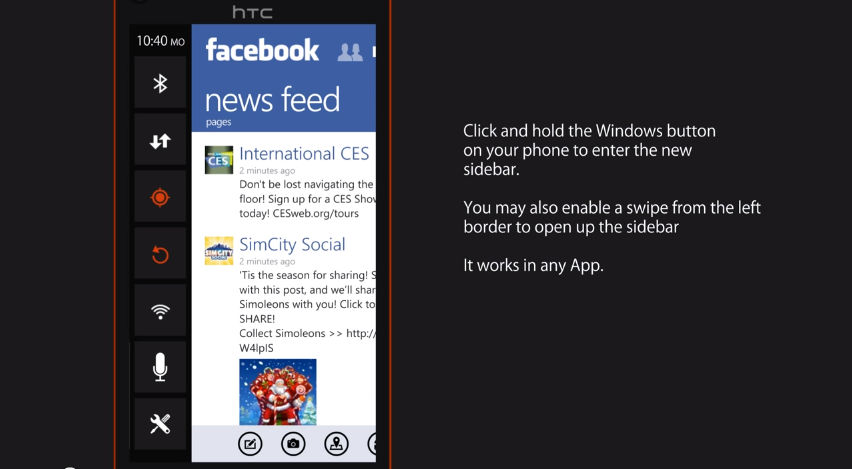
Video: WP 8.1 Metro UI Concept
Fresh off my latest rant against WP’s apparent lack of development, I found this video concept for some suggested UI changes and navigation in WP 8.1 or whatever it’ll be called. The concept is based on implementing a notification system and shortcut hotbar into the left side of the device, and a multitasking pane to the right. Although this concept may not be ideal (to much swiping and navigation to get something done) it’s just one more possibility on how to get things done, the one part I really liked about this was the way the whatsapp, Skype and other notifications were shown. With a simple red badge to alert you of a new notification; with the option to slide into it for more detail. Good stuff.
http://www.youtube.com/watch?v=AJRGexODxX0&feature=youtu.be
Category: Lumia, Nokia, Video, Windows Phone


Connect
Connect with us on the following social media platforms.