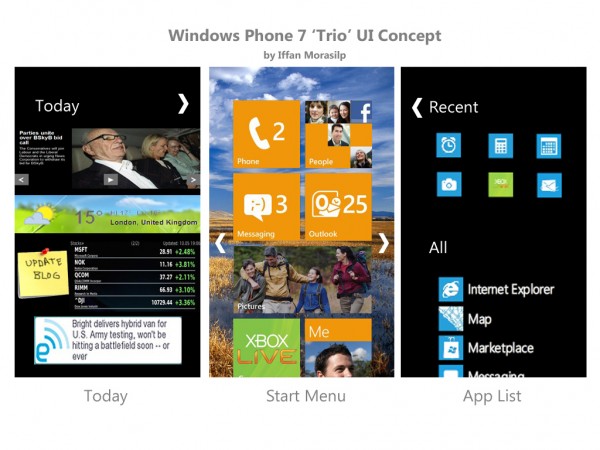
Windows Phone “Trio” UI Concept
First and foremost, let’s look for some constructive discussion before unleashing your fingers to your keyboards.
OK. We’re looking here at the design of just the homescreen and not the rest of the Metro UI in Windows Phone. This is a good start point as any as that’s what’s often criticised in Metro.
This concept comes from Iffan Morasilp who emailed us his idea . It includes a three screened affair (much ideal, and integral to a few concepts we’ve seen before).
Main screen
The main tile homescreen is present but it now has a background instead of a simple Black/White. This for many makes a huge change to the perception of Windows Phone, simply adding some personality with personalization. Having backgrounds suits Windows Phone, if you check out MarketPlace, Music Player, Photos, your background is adorned with beautiful backgrounds (from your content, by your choice or the phones) and doesn’t affect readability of the display. This, IMO, needs to continue with the ‘homescreens’.
The tile is also aligned to the centre and not the usual left-shift in Metro. Â This does somewhat make better usage of the space.
Check out this other concept for a particularly beautiful change to the tiles. Whilst still in the tile-grids, the whole width of the phone is used and so optimizes on the available space. Note that there should also be a balance between using all the space and having too much information on screen. Whilst most power users would be fine with that, novice users might not be (and this is where the mass market is at)
Here’s some of Jozef’s take on having backgrounds (See point 3)
Also Peter’s early take on backgrounds.
Optional to keeping the tile homescreen is having cubes, from Peter.
And another of Jozef’s fine work on changing up a lot of the UI for Metro. Maybe for Apollo when Nokia is able to put their ‘Nokia Stamp’? Note Jozef’s multitasker is now in MeeGo Harmattan (albeit N9/N950 has additional grid space when zoomed out)
Right [App List]
The listed app view persists but now has a most recent used apps view at the top. Lists lend themselves to a lot of scrolling, but this big font alphabetical order does make it easier to find an app (than grid/folder hunting). Fortunately scrolling is very smooth and fast. Search button I guess nullifies difficulty of finding apps. As would a PERSISTENT scrollable alphabet on the side.
As a power user myself, I do prefer grid style and hope this is at least a choice we’d be given (I don’t really see the scroll list a mandatory part of Metro – well there are those that would disagree – the big font list thing is very Metro) but the list view is a very easy way of getting around to all your apps (plus things do end up in hubs, like Games, Videos+Pictures, and Mango will be linking all relevant apps together).
Live thumbnails as shown in Jozef’s work could solve the need for folders by pinning grouped apps in the main screen.
Left [Today]
I guess this takes cues from MeeGo’s left screen.
Iffan describes the screen as bringing:
…you the latest information about things that matter to you in a form of widget-like including;
> Breaking news from BBC, CNN, etc.
> Live Weather
> Stocks
> Web feeds e.g. Engadget
> Notes / To-Do List
> ETC.
I agree with the concept of a third screen. It’s much needed in Windows Phone. The whole thing is about panoramic swiping and I don’t think it would be too confusing for even novice users to swipe between three homescreens (once said to be the optimal number).
I think we may have seen another concept of having some freeform widgets on the third screen before, but this mostly replicates tile work. The today screen makes a lot of sense (and is implemented by MeeGo Harmattan) showing you all the relevant stuff to you that is happening right now.
Category: Concept, Nokia, Windows Phone


Connect
Connect with us on the following social media platforms.