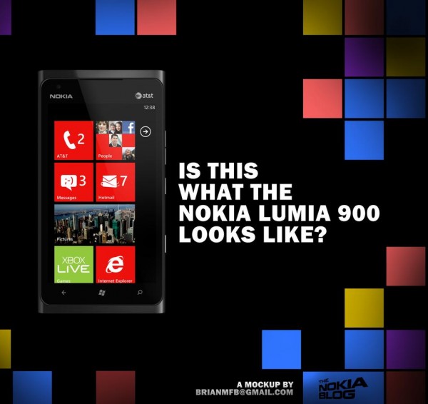
Is this what the Nokia Lumia 900 looks like? Mock up…

Last year (lol 3 days ago) we saw some leaked renders of the Nokia Lumia 900. One of our readers Ahmet tipped as an image with both slices stitched together (above). Well over at Mark’s blog one of his readers named Brian put it through photoshop and with a bit of magic made this:
An issue our readers have raised is that the screen appears to no longer be curved. Some have said it’s possibly not visible in these mockups. But it does look like the screen may be flat with an unfortunate raised bezel across the edges. Hopefully not too raised like all of Nokia’s previous attempts of raised bezel that abruptly stopped swiping. Well it does have a purpose in preventing grit scratching your screen if you place your phone face down.
Another issue is possibly how far in the camera button seems to be. I thought that too but if you consider one handed operation, it’s easier if it is placed there – the arc movement of your thumb can reach it better.
Source: TheNokiaBlog
Thanks Joe for the tip!
Category: Lumia, Nokia, Windows Phone


Connect
Connect with us on the following social media platforms.