Apple joins Nokia #TeamYellow with new colourful (Lumia 620 looking) iPhone 5C (#Ramble)

When Apple was fighting Samsung over Sammy’s CopyPasta activities, Apple had used Nokia’s fabula designs as an example where other manufacturers could create great design without copying Apple. i.e. Apple recognising Nokia’s unique design.
Isn’t it strange to see that after years of simple black/white and some metal/greys, iPhone has succumb to Nokia’s push at reintroducing colour back into phones?
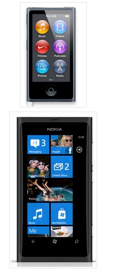
Nokias have always been super colourful. Way back before Lumia, way back before Nseries, all the way to their roots. To be fair, Apple has had some splashes of colour too with their iPod nanos (which some say look like Lumias or vice versa but Apple themselves have said that Lumia essentially is its own unique design, NOT copying Apple).
I don’t think I posted about the iPhone 5C before, when some folks commented that it looked like a 620? Well at the time all we saw were the white ones (though it was expected they’d come out colourful). Even the engadget article comments that it looks like a 620.
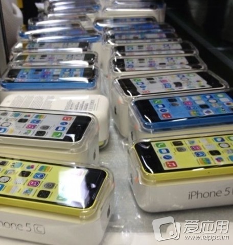
Check out the picture above which shows the iPhone 5C in new colours, the front closest being #TeamYellow.
For a long time, folks have expected Apple to break away from their one phone/year strategy and look towards claiming the cheaper segments to attack Android and now Nokia’s comeback. Clearly, the mid-range and first time buyers have been helping Nokia with their rainbow entry level lumias that provide high end experiences. Apple wants some of the same.
Is this something to fear or have Apple fallen into a trap? i.e. Apple is luxury. It’s about that separation in terms of monetary value. It’s that perceived lifestyle that you’re somehow ‘better’. Would people still buy the new iPhone when they can get the cheaper one?
Or is it? iPod nanos are relatively ‘cheap’. Perhaps it just means folks who want a new iPhone may be able to afford one (and not just go for the old model or a non iPhone).


How much cheaper? Some say not that much? At what price of the user experience? (Apple is not Android, and they might be more worried about sacrificing user experience for marketshare)
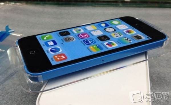
Nokia Cyan Blue? Also Matte, but the gloss packaging hides it.

Last year, Marko Ahtisaari said he wanted to outdesign Apple. Some were doubtful, but what we’re seeing speak for themselves.
http://mynokiablog.com/2012/09/06/marko-ahtisaari-wants-to-out-design-apple/
Instead of sticking to the norm of boring slabs, Nokia went a different route and brought back their history of colour to their lineup.
When making disruptions, you want to break the rules, change how the game works so that everyone follows you and your rules. Now everyone’s trying the whole colourful phones thing again (as well as OIS, wireless charging, super sensitive screens). Apple going with colourful phones only reinforces that Nokia were right to be colourful and that this is the design choice to go. In the same way that other manufacturers are scrambling over imaging technology with their fanciful (but not hype matching) camera technames, because they see Nokia constantly soaring to the top, they all serve to reinforce the importance of imaging in mobile devices. When you follow, you reinforce the trendsetter. As long as the trendsetter is the best at doing it, they can make immense gains. (Such is what happened with Nintendo initially, and then Apple with the touch screen, though we’re now seeing the latter parts of their cycles).
We’re seeing some growth for Nokia/WP, slow, but steady growth. Let’s hope Nokia can continue to capitalise on their innovations (and that MS can let Nokia loose by improving WP/removing restrictions) and that the competition doesn’t take full credit.
Source:Â iapps.im
via Engadget


Connect
Connect with us on the following social media platforms.