New Nokia 311 Pics and look at the new multitouch, swipe S40 touch N9-ish UI in funky cartoon style manual
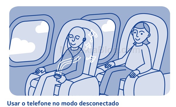
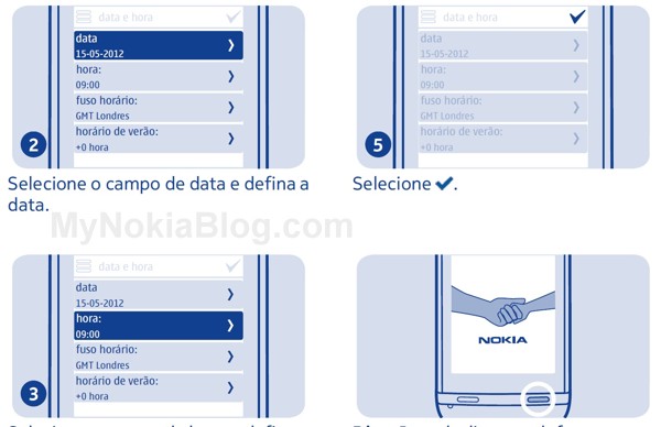
Lookie. More pics of the Nokia 311. But not just that. It comes with a cute manual unlike any I’ve seen before. It’s depicted like a little comic of sorts. It seems very personable, what with your guy (a cartoon character) using the phone through different tasks. BTW Nokia, please make all your future manuals like this. It’s a lot less clinical, and looks more approachable that this is a device for people.
Previous post:Â Bigger Picture:the leaked Nokia 305, 306, 311 (Smanua40 full touch)
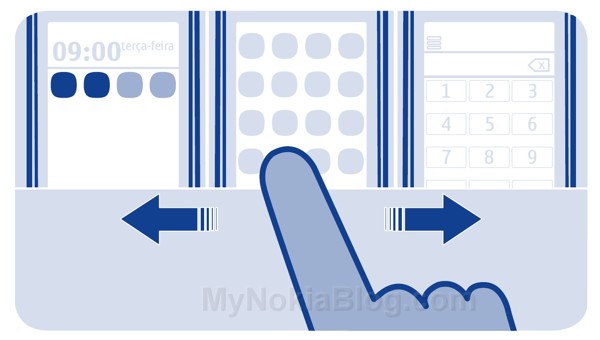
What we can see again is more SWIPE.
Swipe them screens. Central MeeGo Harmattan like icon grid in middle, then homescreen on left and dialler on right. But based on what we last saw, these can be configured.
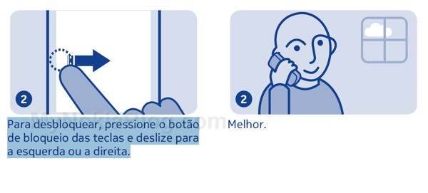
Swipe to answer
A look into the new UI. It’s very N9 like with those >
We can see pinch and zoom. That’s multitouch on S40 (if this is S40).
There are also pull down notifications. We’ve seen it before in the old manual but nice to see again.
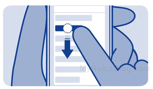
Reorganising lists?
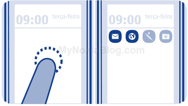
Widgets
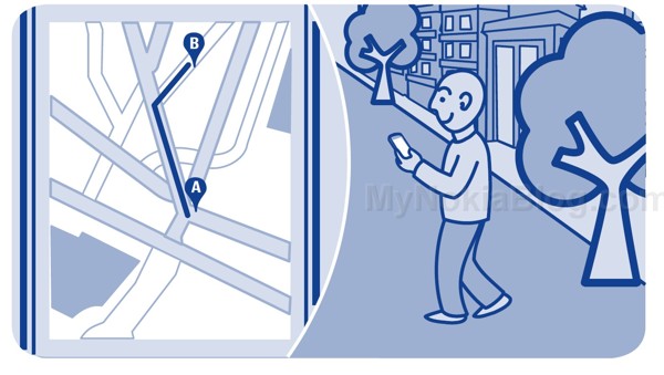
Maps navigation
Check list
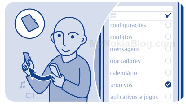
MeeGo Lite anyone? Meltemi? S40 Touch? Whatever it is, it’s looking mighty fresh.
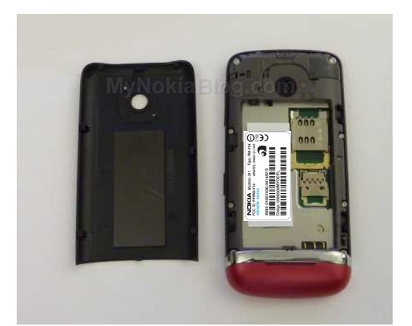
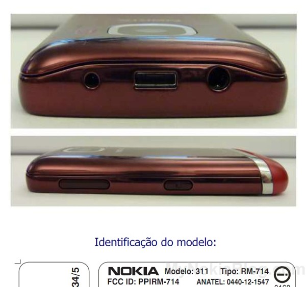
More 311
Source: Â pinguinsmoveis
Cheers for the tip, Loci!
Category: Nokia





Connect
Connect with us on the following social media platforms.