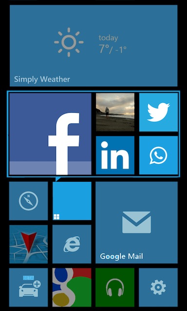
Concept enhanced: Closer look at folders for WP8.
Advertisements
Whilst we’re on the discussion of concepts on the last post, I just wanted to highlight another based from Friday’s post. In particular looking at folders on the homescreen, the most discussed portion of the post.
http://www.theverge.com/2013/4/6/4191250/improved-folders-concept-for-windows-phone-mock-up
In this post, we’ll see the other instances of the folders, such as when there are more than four items, or containing even larger sized live tiles.
A gif file attempts to show these ideas. This isn’t visible in the main body of the original post.
Via: Reddit
Advertisements
Category: Concept, Nokia, Windows Phone


Connect
Connect with us on the following social media platforms.