Short Nokia E6-00 Review from MyNokiaBlog.com
It seems so strange that it was all the way back in January that we found out about a possible E6-00. Starting with leaked sample images, then details about a supposed all new VGA screen. We speculated about the design, until the first leaks appeared and we weren’t all too happy. But then clearer photos appeared to show this thing is actually quite a beauty.
It was officially announced on April 12 and Sergejs was amongst the first few people to have a play with the E6-00
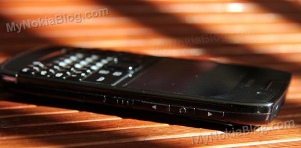
Thanks to @WOMWorldNokia, we had a couple of weeks to play around with the Nokia E6-00, the first Symbian^3 portrait QWERTY handset. (Thank you of course to you, our readers, your presence is why WOM would send us such handsets :D)
We unboxed it in a gallery of 101 photos. Why 101? The camera loved the sexy E6! It just oozes class and was a very photogenic gadget. You may want to check that post out to see the Nokia E6-00 package contents.
Excuses time….I’ve been somewhat rather busy doing house renovations/redecoration so this review is shorter than I had expected and doesn’t go into too many areas or in much depth. But I have covered what I found were the core parts I felt were important.
Here’s what this review will consist of
Hardware
- What’s What
- Build
- Screen
- Keyboard
- ‘Camera’
- Battery Life
Software
- First set up
- Making a call
- SMS
- Web Browser
- Multitasking
- Menu
- Homescreen
- Apps
Conclusion
Hardware:
1) What’s what?
The front of the E6 has as standard, the front facing camera, ambient light sensor and proximity sensor. In the middle is your earpiece.
Just over a third of the face of the E6 is the touch screen. 2.46†640X480, (4:3 VGA) multitouch display.
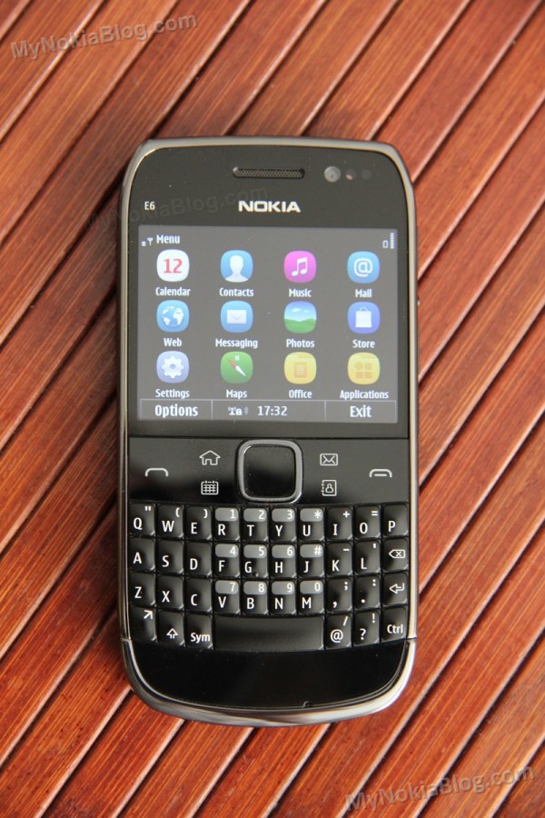
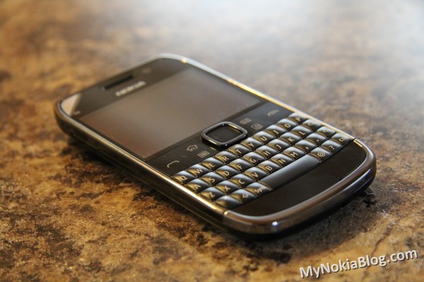
Underneath are your softkeys, call/end at opposing ends, shortcuts (home, calendar, email and contacts) and a D-Pad in the middle. Below this is your full QWERTY keyboard.
On the left side is just the micro-usb port, hidden away by a well fitting cover.

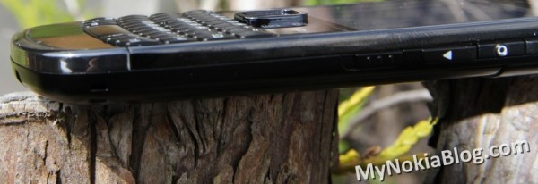
On the right you have volume keys, a voice control button and lock keys. Long hold of the lock switch activates the dual LED as a torch when in homescreen view. There is no dedicated camera key.
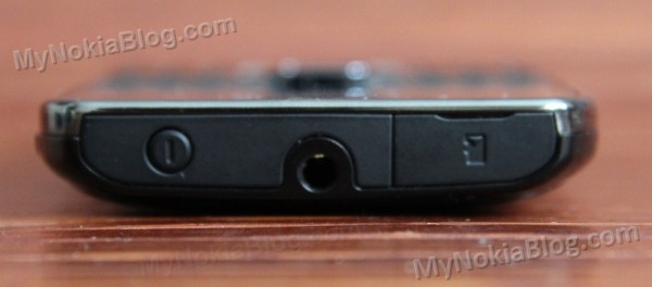
At the top is the micro-SD port, hidden away also by another well fitting cover. You’ve also got a 3.5mm jack and a power button that as with Nokias acts to change profiles.
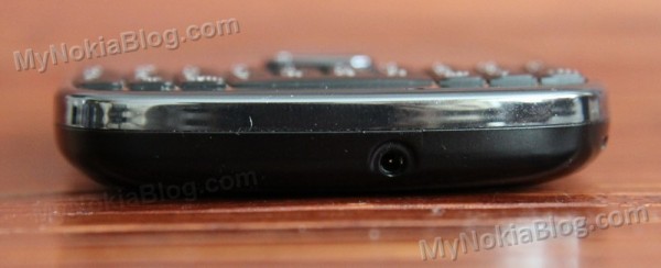
At the bottom, you just have the 2mm charging port. The E6-00 can charge either way and it’s of a great convenience having both methods.
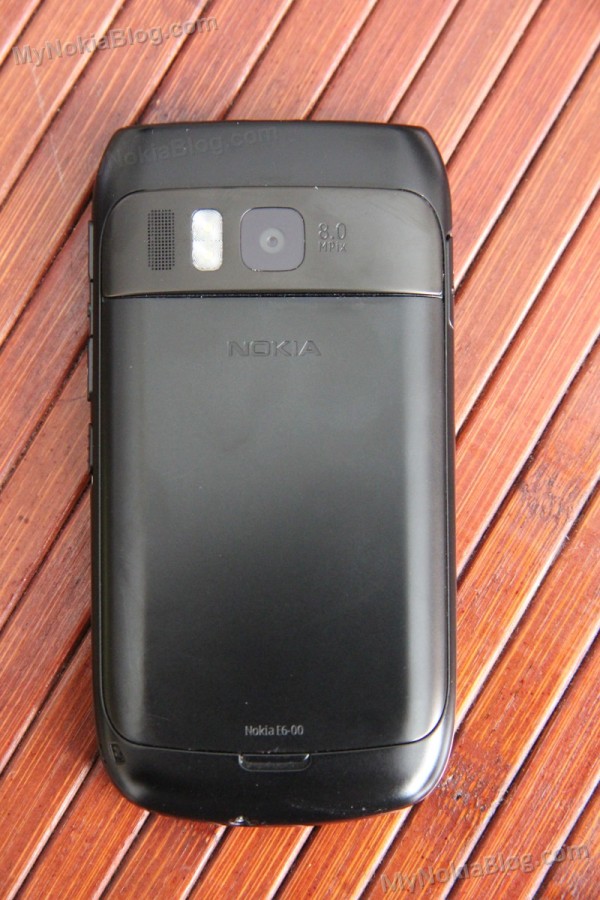
Finally the back sports your slightly raised 8MP EDOF camera, dual LED flash and speakers.
2. Build
The E6 is made of a combination of metal, gorilla glass and high quality plastic. This is a very well build tank of a device, and the only sound I can get is a reflex tap when squeezing really hard over the text saying 8MP. This is a solid blunt instrument that could be used as a lethal weapon in the right hands.
The E6 looks and feels slim. It is very comfortable to hold in either with one or both hands, and doesn’t feel like it’s going to to slip and drop when in use.
3. The Screen
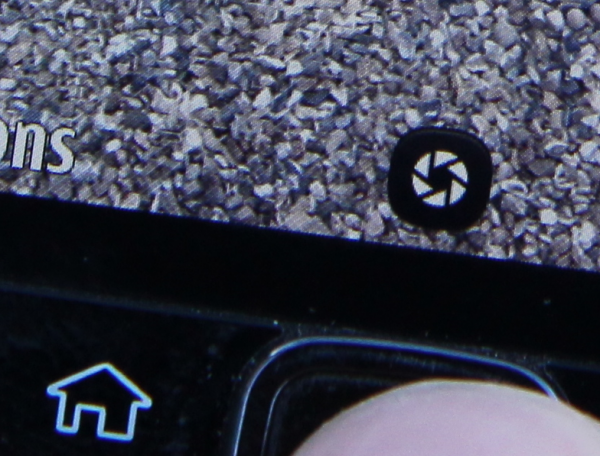
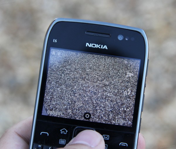
For the past 3 years I’ve become used to 3.5†plus screens so going to 2.46†initially felt like a step back in time. However, the screen is really sharp, sporting 640X480 pixels – more than any current Symbian line up so it’s not short of detail when browsing things like the web. However, I have found on occasion that the text really is too small so have increased font size where available. I am finding that in comparison to a beastly 4†or even 3.5†screen, I’m more likely to have the E6 just slightly closer to my face to see the text. Darn it, is that my age showing? :p
Here’s the sharpness showing. Look at the level of detail in the little rocks.
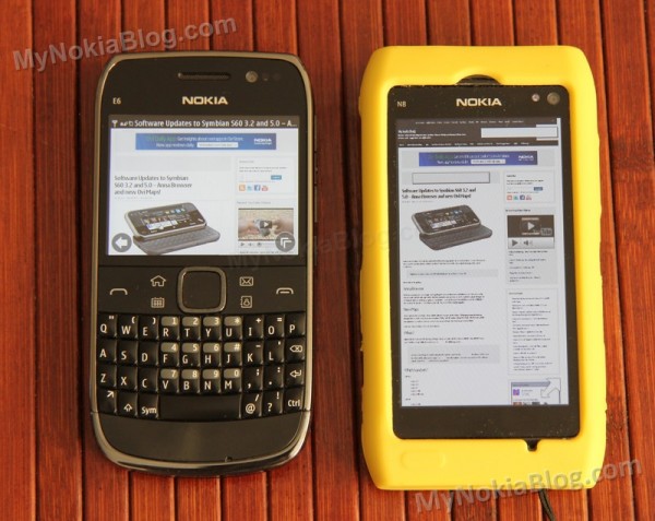
The colours are great for LCD, but you’ll definitely notice the vibrancy of the N8’s AMOLED when compared side by side. When set to default (middle) brightness, the blacks are quite black. Viewing angles are quite wide even at extreme angles.
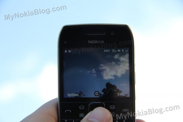
Outdoors, the screen is very visible even in direct sunlight. The only problem being reflective screens.
The E6-00 has a capacitive touch screen and this is very responsive. It’s that feather-light touch that you’d expect from capacitive displays and it’s also very accurate, leading to minimal mispressing (despite the screen being smaller than what you’d expect for a touch-enabled device).
Tips:
1)     In Opera Mobile, I’ve set it to view pages in mobile, thus having much better text reflow. This is important as when you zoom in, you don’t want to be constantly scrolling left and right, instead, the text realigns itself to fit less words on the screen with your larger font size.
2)Â Â Â Â Â Font size can easily be changed in messaging. Settings>Font size.
3) Worth putting a screen protector on. Or leave the one it comes with as long as you can.
4. Keyboard
I was initially doubtful I would get along with a physical QWERTY again. My time with the awesome E7’s keyboard wasn’t enough to win me back to physical keys as I had already made the transition to a very excellent virtual QWERTY keyboard (on Windows Phone).
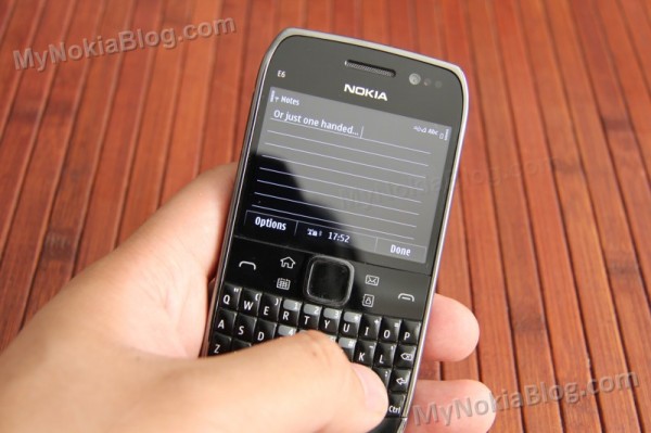
I was shocked how well I could type with the E6 keyboard. I loved typing on these keys. The keyboard has great tactile feedback and isn’t too hard to press. Also the relatively small distance between the keys meant I could glide and slide my thumbs across the keys. Both of these aspects were important for me as I had gotten used to the feather light touch of capacitive virtual QWERTY keyboards.
Each button is a convex dome, sufficiently raised in the middle.
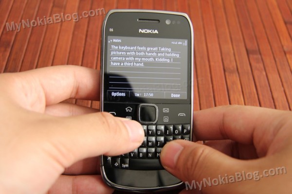
Even though my hands are relatively large, getting the tips of each thumb was easy enough for accurate typing either one handed or two. I prefer the latter.
. One advantage with physical keys that I can’t get on current virtual keyboards is the ability to type without looking.
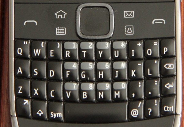
There are 37 keys in total, and all placed at just the convenient positions.
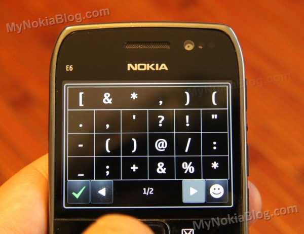
The number keys occupy the centre, and are activated either with long press or pressing the function button when in text mode. The more popular punctuation/symbols keys are placed around the number. To activate secondary keys, likewise, long press or press the function button. Shift key controls caps locks and the SYM key brings up the full array of symbols on the touch screen.
A control button lets you use traditional shortcuts such as copy and paste (ctrl+c ctrl+v). The spacebar is relatively large and placed in the middle, with delete and return/enter key on the side one above the other.
LOVE THE KEYBOARD!
I was extremely pleased with this wonderful QWERTY keyboard.
In addition to the QWERTY keyboard are the six softkeys and your D-Pad. The call and end keys are standardard, but you do get the Eseries shortcuts for messaging, calendar and contacts. You can change these shortcuts if you wish in settings. The home/Menu button acts as your usual Symbian menu key, bringing up homescreen, menu and finally multitask when long pressed. These softkeys aren’t individual keys but they don’t lose accuracy because of it. More over, like the menu button, long pressing of these shortcut keys performs another task (which you man change later), e.g. long press on email to write a new email.
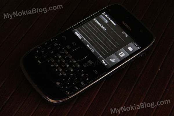
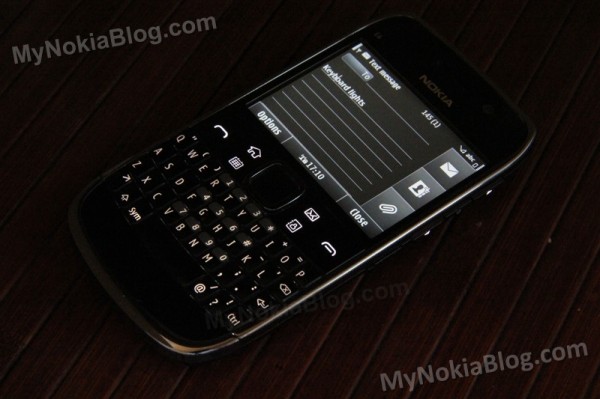
All keys are backlit. The softkeys and volume keys are all white, with the QWERTY keys being some kind of beige. A nice, subtle feature is how the lights fade when you turn them off. It doesn’t just turn off but fades from the edges inwards. That’s impressive attention to detail.
Some tips?
1)     Turn on predictive text. Though it adds some annoyance of its own, on the whole it does make texting much better, correcting minor typos, selecting appropriate punctuation. Be warned though, to check what you’re typing again with predictive text as I have on occasion sent out messages with wrongly corrected (totally changing the meaning) autocorrects.
2)Â Â Â Â Â Press Shift and Symbol simultaneously to bring up choices of writing language. The phone provided me with this tip itself.
5. Camera
It didn’t really excite me, although that is difficult coming from a Nokia N8.
It’s perfect in bright, perfectly lit scenic conditions. It has trouble in low light, no forgiveness for close up subjects or subjects that are moving.
This phone really isn’t intended for those with interest in photography, as evident by the lack of camera button. You’ll take photos using the d-Pad (and for quick photos, you’ll have to activate it by pressing a short cut on menu or homescreen)
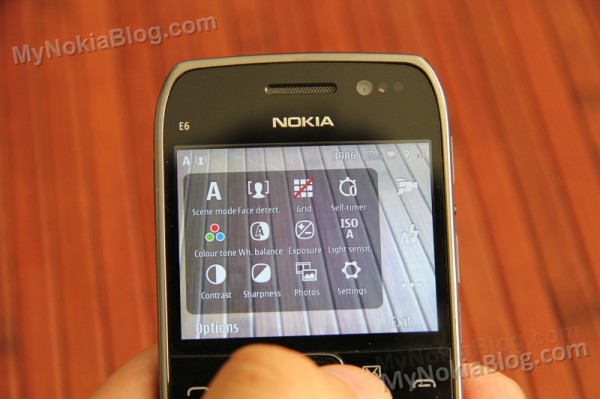
The mismatch in colour is not the E6-00 screen, it's an off white balance when the subject is too close.
The camera is there and it’s good enough. To make a point although the camera is lacking compared with Nokia’s other offerings, on the whole it’s a darn sight better than my Omnia 7 (except only when doing macro).
Video is actually quite good quality. You can use the dual LED light during video recording which is bright enough to light up subjects within 1M, possibly 2.
6. Battery Life
Usual day to day use would get me three days out of the E6 which on my Samsung Omnia 7 would barely struggle half a day. However, you do have to be careful and keep an eye on multitasked applications as leaving too many on can reduce even the Nokia E6-00 to just one day’s use.
It was a refreshing experience to have a smartphone that I did not really worry about how much I’m using it or if I’ve charged it. It actually threw me off my timing a little as I had learned to associate 2 recharge times with 1 day.
Although the display shows more pixels than any Symbian^3 handset, this is offset somewhat by the smaller size, and so the 1500mAh battery supplies more than ample amounts of juice. On the plus side, this is your standard Nokia-Hero battery, the BP-4L which with the removal battery cover you can just swap over to a new one.
Tip:
Make sure you watch out for apps your multitasking as having lots of live apps multitasking in the background can reduce your E6 battery life to 1 day.
Software
1. First set up.
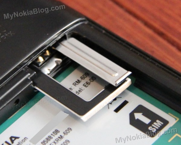
Popping the battery and SIM in was simple enough, the SIM card however has a nifty new entry style where a sliding piece comes out, but instead of placing it in like a tray, to slide it in between the two metal pieces (like a SIM sandwich) and then push the SIM into the phone.
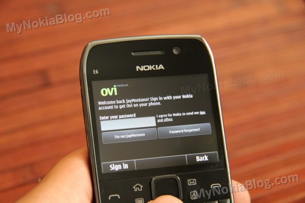
I was initially hesitant of swapping my main sim over to the E6-00 as I didn’t want the hassle of setting a phone up again but it was actually pretty easy.
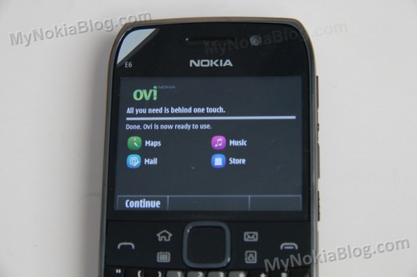
With my main SIM, the Nokia E6-00 had recognized my Nokia Ovi Account correctly. Just popping my password in once results in Ovi signing in to all my relevant Ovi services on the E6-00 (Ovi Store, Maps etc).
The E6-00 will also prompt you to get your contacts and mail account. I was hoping it would just do a Nokia Ovi Contacts sync but instead it asked me to use phoneswitch. This was always my preferred method over the years moving my Nokia contacts from one phone to another. You just pair up the phones (very easily, just by confirming the Bluetooth pins, i.e. just accept) and you’ll send over all your contacts (you can include SMS/MMS/calendar entries too if you like).
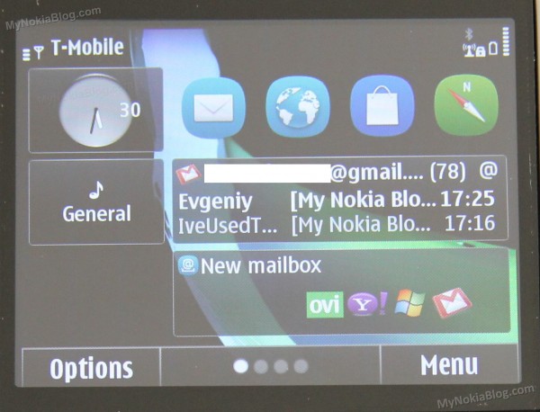
With email, that was as simple as email address and password. If you do set up email, you’ll automatically have a widget set up on your homescreen for that email account.
2. Making a call
To dial a number, just type the numbers on the keyboard when in homescreen view. You don’t need a shortcut to bring up the dialler.
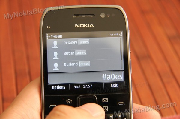
Furthermore, to search your contacts, just type their name too. No need to open up the contacts application.
Either press the call button (would often be green but it’s just white) to call, tap their name to call, or long press to interact with them in a different way (e.g. email or sms)
Press the green call button for last dialled numbers, and you’ve also got tabs for received and missed calls.
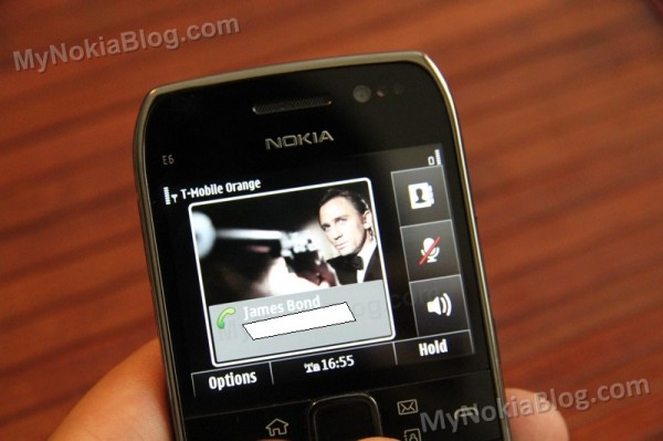
Other shortcuts from homescreen include:
- * Long press for Bluetooth
- # Long press for profile switch (silent/general)
- Lock switch for torch
To end call, press the end call button (what would typically be the red button, but it is also white here by design).
Voice Quality
What can I say, it’s typical Nokia. Strong, reliable signals, clear voice quality on earpiece and receiving end.
3. SMS
Same experience with other Symbian^3 handsets. Nothing much to report other than it being a joy to write messages due to the E6’s keyboard.
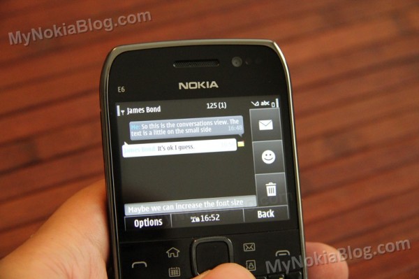
The font is a little small though in conversation view and nothing seemed to change the font size. You could always click on each message to see it in larger font.
4. WEB BROWSING
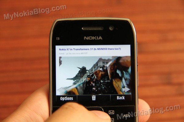
Browsing the web is actually quite OK now on thee E6-00 with Anna. It’s faster and there are UI improvements that make it much more pleasant to use than the old S^3 browser.
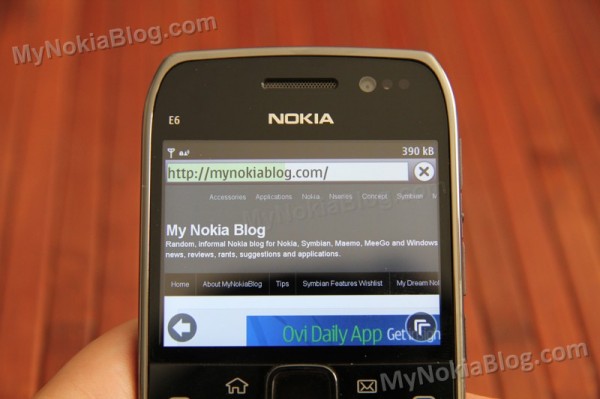
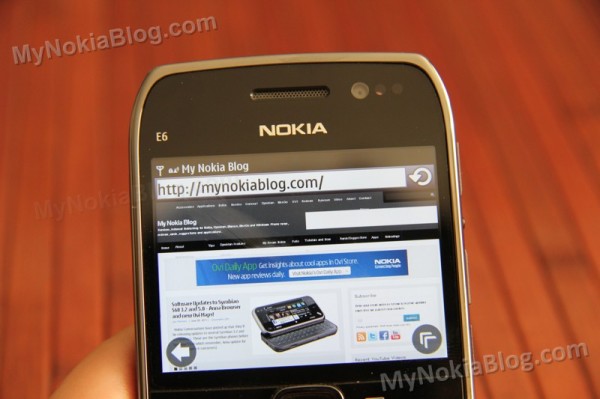
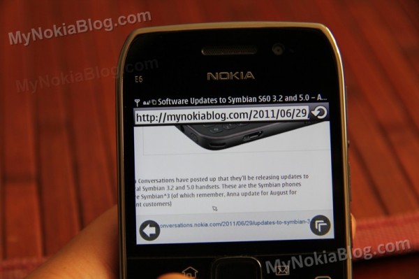
The presence of a persistent back button/ address bar at the top (which disappears after scrolling) streamlines the experience.  The load progress of each page is shown by the filling of the address bar in a block of colour (theme dependent). I find this visual cue very helpful when seeing the progress of a loading webpage – no random blank or downloaded file size that gives no indication how much is left to wait.
The address bar is displayed at the top and disappears when you scroll down to allow for automatic full screen viewing. Fortunately, you don’t need to scroll all the way back up to see it again, just tap/swipe the top bar and it pops back up. Tap it again to get rid of it.
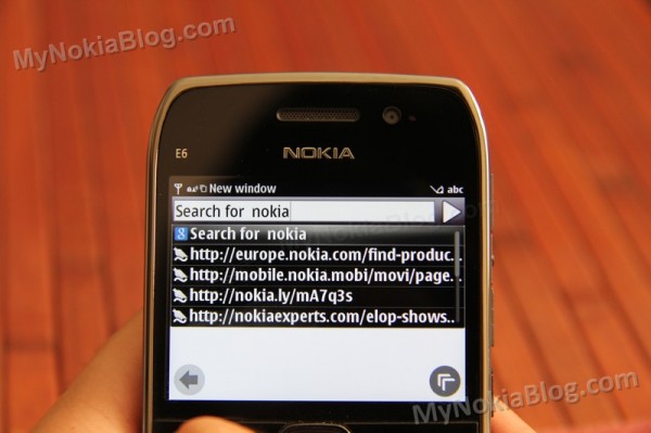
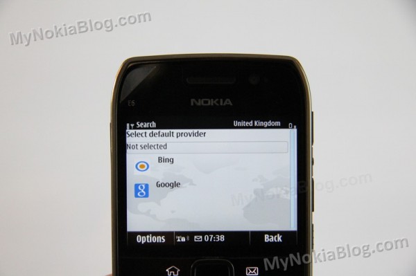
The address bar acts as both address and search bar, (like firefox’s awesome bar) but instead of typing and entering you have to select “search ____â€. At first search, you’re asked for your default search engine (providing BING and Google as options).
I think that’s great that they let you decide first as opposed to lumbering you with one or the other and forcing the user to switch that themselves. I’ve set mine to Google. Typing in the address bar gives suggestions of previously visited sites.
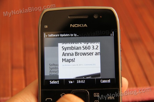
The persistent back button is very helpful, cutting down clicks to move back by one. Having said that, it still means two clicks to go back to the previous page as instead of going back, you’ll be presented with the classic carousel of page history. This has its uses. A similar annoyance was faced with first versions of Maemo 5’s MicroB, but a later update changed the back button to just that, and a side swipe gesture brought the history in carousel mode. I’m not sure if that would be at all possible now for Symbian. It would be nice if you could flick scroll to one end of the page history instead of only one page.
Another new feature in the new browser is the much awaited tabbed browsing allowing you to open multiple windows.
If you long press over a link, you’ll have the option to copy or open in a new window.
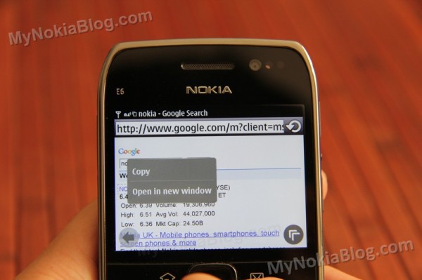
Alternatively there’s a quick options button (that presents you with icons of browser options) where you can open a new tab.
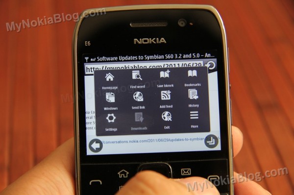
This is also how you switch between webpages, carousel mode.
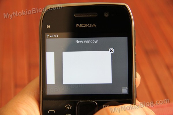
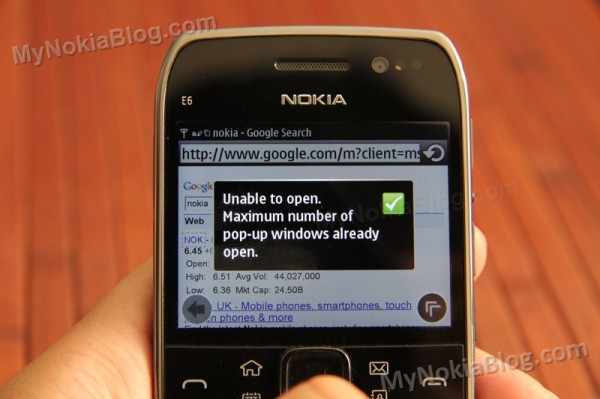
I’m not sure if this is just for the E6-00 or Symbian^3 in general, but the maximum number of windows you can open is only three. 3. Just three. At times, depending on what’s open, I seem to be limited to two. Perhaps this is to prevent too much memory usage? I don’t know if that may have contributed to the random, though rare, crashes I’ve had with the default browser.
Mind you, Windows Phone only has 6. Whilst that limitation on WP surprised me at first, I got used to it. It was possibly helped by the fact that I could switch windows extremely quickly as there’s a window switcher button in permanent view. Furthermore, the windows are displayed in a 2×3 grid, thus making it very easy and fast to change from one website to another. Possibly such a button was omitted as not to intrude too much on screen realty? A suggestion would be possibly to use a swipe gesture or to have translucent buttons.
Scrolling large pages still isn’t as smooth as it should be. Heavy pages do wear the Anna browser down and even light pages are no where near as smooth as it should be when scrolling.
Having a D-pad means you’ve got a mouse cursor. This means you can browse the pages without ever touching the screen. This is actually quite helpful if you’re reading a long block of text as your thumb can just press down instead of travelling to swipe.
Tip!
You’ll also want to install Opera Mobile as that’s an excellent browser for using on the E6-00. Mobile view is particularly helpful as Opera Mobile has better text-reflow function. You can load more windows at the same time and can be quicker on slower connections.
5. Email
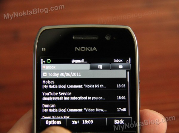
Email experience on the E6-00 was decent. I used my gmail account and after signing in, it picked up all my mails. At first there seemed to be a delay when other devices would receive items, but it’s evened out now.
I rarely had the issue I faced with my N8 whereby mail would just appear blank, taking forever to retrieve the contents (when setting to forward instantly allows all the contents to be visible) but on occasion it did happen.
The connection between some apps and browser to email is as expected
d and helpful to the whole experience (e.g. sharing relevant contact quickly by mail).
There are so many buttons on the QWERTY keyboard, they should do something right? I was very pleased to see keyboard shortcuts during email.
- Moving to more recent email (P)
- Moving to older email (N)
- Forwarding (F)
- Responding (R or A)
Calendar:
I didn’t really bother using this. I’d expect that once I put my gmail it should pull my Calendar details (like on my Windows Phone) but no. I also thought Ovi Sync would pull previously synced calendar details but that didn’t work either.
6. Multitasking
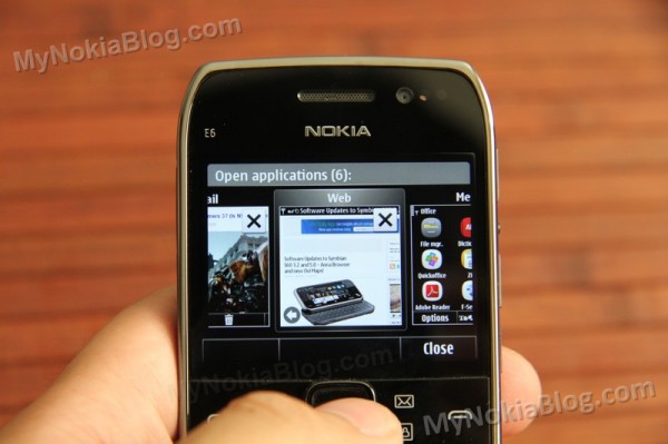
Multitasking behaviour is as expected in Symbian. It’s great. Just like with other Symbian devices, long press the menu button (the home/house one) and you’ll be presented with all your running applications.
Like with S^3 it’s very easy to switch between applications; either swipe scrolling through carousel (which is sufficiently smooth) or long-press and select, switching you between the two applications you’re currently using.
The square nature of the multitasking cards makes more sense somehow on the E6’s VGA 4:3 display. To exit, just press the X.
I’m much more of a fan of Maemo 5’s grid style approach but on a screen of 2.46â€, the scrolling makes sense. And I guess it’s possibly easier for first time smartphone users given the widespread nature of scrolling card multitasking interfaces (also seen in MeeGo, which implements both scroll and grid; BlackBerry’s Playbook, Palm’s WebOS and Microsoft’s Windows Phone).
7. MENU
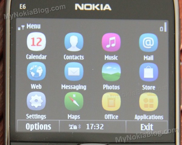
You have a 4×3 grid of new funky Anna icons. To move them, just long press on the screen. In this mode only, you can create folders and reorganize apps into folders.
I have only had two weeks with this phone so I haven’t had time to totally torture the handset with tons of app downloads and media content. It’s sufficiently quick though. Folders open up quite promptly and with less of a delay than my Anna-less N8.
With Anna we’re brought with a spinning circle when there’s a possible delay. This is helpful in recognizing the phone is doing something, rather than freezing. It’s not as flamboyant as other devices that use full screen distraction animation, but it does help.
Every time you open the menu (either first time or shutting down all apps) you will see this loading circle. The next time you open the menu or other folders, it’s instant as it’s stored in memory, but I’d recommend killing apps when you can to preserve battery.
Everything else is just like Symbian^3
8. Homescreen
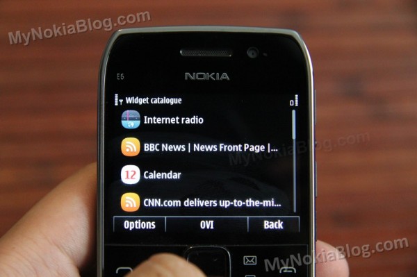
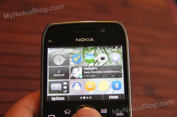
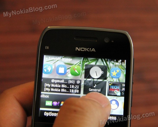
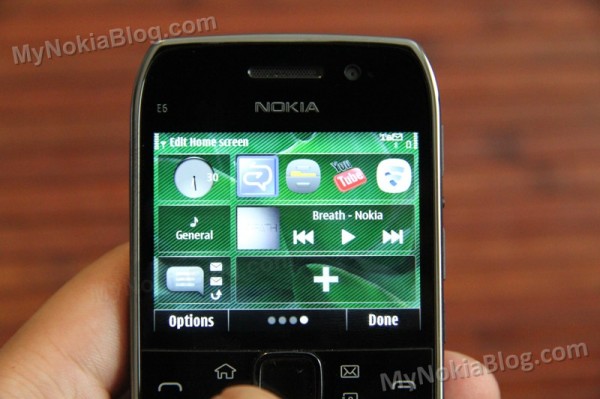
The E6-00 being Symbian^3 is all touch. But the smaller physical sized screen and VGA ratio means a reworking of the widgets. There are three per page (5 pages in total). On the left you have the clock, profile and a box that appears to indicate missed calls or messages (and disappears once you’ve seen them). Unlike with nHD S^3, you cannot move the smaller widgets on the left.
A very, very nice move with Anna is the now draggable homescreen. It makes such a difference to the experience of these multipaged homescreen that now, they follow your finger. It was such a big mistake to design it the way they did before to create a fake lag, supposedly to prevent mispressing buttons.
You can navigate the homescreen with the D-Pad though I find swiping the best method.
To edit widgets, just long press move widgets around. To add new widgets, select either empty widget spaces or delete widgets and accordingly press empty spaces.
Widgets available in S^3 oddly don’t all seem to work here. I can’t get gravity widget as an option.
9. Apps
Bundled Apps
The E6 has a few really useful bundled apps.
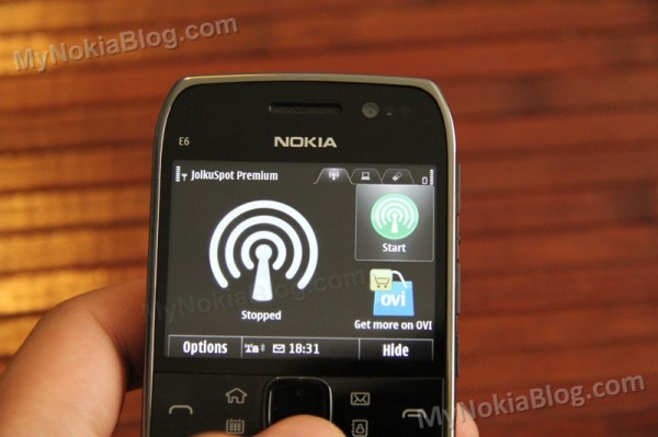
JoikuSpot Premium is included, allowing you to immediately share your WiFi connection with other devices. I have this on my N8 and N900 and it’s awesome to have this preinstalled on the E6. It works great. Press the big green button to share and connect to it from your device. By default, no passwords are necessary (this means folks can and WILL try to leach on your connection, as I have found many times iPhone users trying to use my N900/N8 as a hotspot. Grrr!) You can of course easily set up an encryption key.
Other features include ability to see devices connected to you, download and upload speeds as well as downloaded total. Useful features include battery management. If you’re using your E6 as a hotspot for extended periods, I suggest plugging it into the charger and possibly move it to where you have better signal (not that you’d have to move it around much being a Nokia)
You also get:
- Shazam
- Traveller
- Quick Office Premier
- Here and Now
- F-Secure
- Communicator
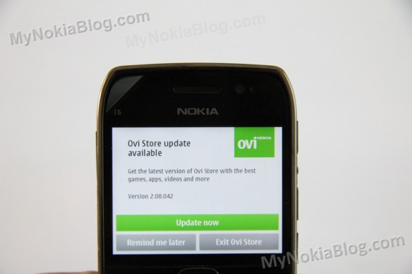
I thought Skype was there but it seems it’s not. You could easily download this from Ovi Store. At first start up, you may be prompted to update it already.
There are apps at the ovi store. At this stage, due to the screen ratio of 640X480 (NOT nHD 640X360) some apps made for Symbian^3 don’t appear for the E6-00 (even though hardware wise, it can cope). I’m not sure though how anyone would use such apps on a 2.46†display, nevertheless, it’s still disappointing to have this fragmentation.
Gravity and Opera – two must have downloads work fine. You might have to increase font size in gravity. WOMWorld did a post recently on some E6 recommended apps.
http://www.womworld.com/nokia/22197/nokia-e6-recommended-apps/
Conclusion
I’ve never used portrait QWERTY phones for any acceptable length of time and have never found a reason for doing so. BUT I’m a convert to the long list of fans that love the portrait QWERTY form-factor. My experience with the E6-00 has been hugely positive. I would have loved a bit more time to just write down my thoughts and experiences, do a video demo or two but ah well.
What’s been great?
- Keyboard. It just begs to be typed on and your thumbs love you for it. It is wonderfully crafted and you’ll get a buzz every time you know you’ll need to use it. The keyboard shortcuts offer a unique efficiency that you can’t get with just touch.
- Battery life: A smartphone that I don’t fear not charging daily? Quite a new feeling that I can use it as much as I like and not be in search for the nearest plug socket.
- Build and Design:Â It’s a pocket tank. It’s so solidly made and feels great in the hand. It looks great too, it looks like it means business but it’s stunning to look at too. It’s a classy, stunning looking phone.
- There’s a loooooot that I didn’t go through such as music and video playback, mass storage, USB OTG etc. Pretty much every strength of Symbian^3 still lives on in the E6-00
- All of the above together combine for what I found to be a surprisingly satisfying, nay, fantastic experience with the E6.
What I’d improve:
- Screen size: it is a little on the small end. OK for those used to the E71/E72 but does make some parts of the phone a little hard to see.
- The camera: It just doesn’t offer the versatility I need or have come to expect (though expectations are supremely high due to the Nokia N8). It’s actually decent if you compare it to Non-Nokias
- App Support: Though it is Symbian^3 and it is powered underneath with the same stuff the other S^3 handsets have, due to the screen ratio, some apps don’t quite work (and so aren’t even on Ovi Store)
- Ownership of E6 under Jay Montano :p
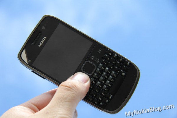 I’d actually love to own the E6 and highly recommend it to fans of this form factor. Even if you’re not, it’s worth giving it a go. It’s a smartphone that encompasses what it is to be a workhorse smartphone. One that you can rely on to get the job done. It’s my favourite Eseries at the moment (more so even than the E7, mostly because it offers me a different experience to my N8)
Whilst you’re here, you might want to check out Matthew Miller’s (palmsolo)Â E6-00 video. He’s got the E71 and E72 (E73 Mode) with him for comparison and has covered a lot of the things I’ve missed out.




Connect
Connect with us on the following social media platforms.