Thoughts on Nokia N9 PR 1.1 + Review of changes
We’ve brought you articles on the PR 1.1 FW being rolled out, available on NaviFirm and also Jason from SmashPop. After watching the video I thought I’d post up my thoughts on the update as well as details about the changes I have noticed.
I’ll talk about a few things in this post.
- New Features
- Changes and Fixes
- Areas To Be Improved
- Hopes for PR 1.2
1. New Features
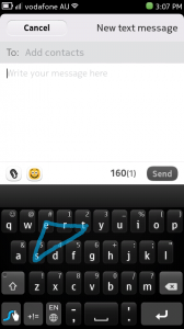
As always when you get a Software Update, you look for the New Features. Like Kontorri mentioned, PR 1.1 is mainly to address bugs and provide some under the hood benefits. That does not mean that the User can’t find any goodies. The first is the addition of Swype into the OS. For those of you that don’t know, Swype is a style of text input, where the user simply drags their finger over the letters to spell the word.
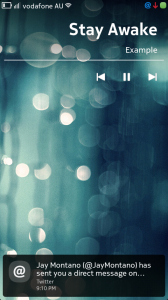
The next major update is Music Player controls on the lock screen. The clock gets replaced with the title of the song, and a Play, Forward and Reverse button are included. If you have notifications, they will still be present in their original location, at the bottom of the screen.
2. Changes and Fixes
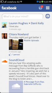
Something that we like about Software Updates, besides new features, is when existing features are improved. PR 1.1 did not disappoint on that front (at least not entirely). The Facebook client has been updated. It is now quite smooth, with a new top toolbar icon change. The down arrow we saw previously, has now been replaced with a 3×3 grid, as well as, if the user has notifications, the globe with the number of notifications present will appear next to it.
On the standby screen, there is now a “charging icon” that sits above the time aligned to the right. All other notification icons (Mail, Messages, Chat, etc. ) still sit below the time, but are now also aligned to the right, not centred.
Camera has received a minor update, with the inclusion of colour filters – Black & White, Sepia, Vivid, Negative and Solarise. The settings of the Camera app itself has also received a nice change. Previously, when altering the settings, these would be reset upon closing Camera. Now, even after turning the device off, the previously used settings will remain, until changed. This is something I am happy about, as I found it annoying when I forgot to take off flash each time I close the app.
Closing apps has also been changed – sort of. Swipe to close was present in the sales release (PR 1.0 ) of the N9, but was an option that had to be enabled in the settings. This is now on by default, and as far as I have noticed, there is no option to turn it off. (Not that I think anyone would want to.)
Twitter has received an update too! You can now post photos using the Twitter app on your N9. Unfortunately, you cannot upload the image straight from gallery like Facebook, Flickr etc. but it’s better than nothing.
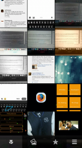
Gallery has changed, with a new way of arranging the filter options. Prior to the updated, it was a scroll-like box. Now it is a semi transparent toolbar. Not really something that is going to captivate the masses, but it is a nice usability improvement. Speaking of toolbar changes, Calendar has also revamped their toolbar icons for “week view”, “month view” and “day view”. Also, the toolbars of native apps now seem to have a shadowing on them, making the toolbar “float” and allowing for scrolling through lists to look a lot more fluid and elegant.
The list of “Transfers” has also had a make-over, changing to an all black design. Previously it was that grey and white colour scheme that many have complained about, as it doesn’t match the “black background” theme that appears throughout most of the OS. Web has also had a bit of updating, now have predictive text. Sadly, there is still no copy/paste in web text boxes, nor can you scroll using the “Magnifier”
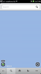
Maps, something that Nokia is notorious for, was implemented poorly on the N9. It’s loading time was shocking, getting about 18 secs start-up time. Now thankfully, it is a lot faster than that getting about 7 secs to change from the splash screen. Sadly, it’s still crap. I have to select the location dot everytime, for the app to “sweep” to the map showing my position. I know it’s no big deal but it is something that drives me insane!
Finally, a subtle change to the UI is the notifications. The notification icon used to be a green flag in the status bar. Now, there are separate blue icons for text messages, chat, mail, missed calls etc. (Haven’t had any SW updates since updating, so I’m not sure if that will be changed or not.)
Under the hood, the N9 has gone through some changes as well. Sadly, I don’t think for the better. And this brings me to the next part of my post.
3. Areas To Be Improved
The performance of the N9 has dropped significantly since the update. I now have a lot less apps then I did before (as the Update removed them all 🙁 ) and I am finding that with only one app running (Resource Monitor), I am at 90 % capacity of RAM, 84.6% being “Idle”. (Idle refers to the OS itself.) This is pretty disappointing as I was amongst the first to praise how without heavy apps, the device was extremely snappy. Don’t get me wrong, it is still snappy, but I’d like to see more.
Not sure if I’m using my device differently, but I have also noticed a significant decrease in battery life since the update. I got only 6 hours the other day, with a constant 3G connection and random refresh of Facebook every now and then.
Facebook and Maps can still be improved a lot more. Although I have been using fMobi more regularly. (Shame it doesn’t support sending of Inbox Messages….yet :p ). Facebook for some reason, will not log in to chat saying “Incorrect Password” despite password being correct (I know its correct because I just change my status back to Online and it logs in. ). As well as being required on several occasions to enter my Facebook password for no apparent reason.
I have been getting a LOT more “Application Not Responding”. More frequently on apps I was getting it before, and now also on apps that ran perfectly fine on PR 1.0.
4. Hopes For PR 1.2
- Video Calling
- Improvements to Facebook and Maps
- Twitter Photo integration through “Share” in Gallery.
- Combined view in Messaging like on WP7 ( Skype, Text, Facebook etc. to same contact is shown in single thread)
- Integration of Windows Live Messenger
- Push Notifications for Facebook and Twitter (Mentions and Direct Messaging)
- Push for Apps downloaded from Ovi Store (At the moment I need to go to store instead of refreshing SW Update list)’
- Text input in web
- Universal text input featuring cut/copy/paste
So, if you own an N9, and haven’t updated you are probably thinking, should I? The answer is yes! Despite the negatives I have outlined, it is still very good. I have actually forgot what PR 1.0 used to be like. (I actually needed to look at my original review series to confirm some changes :p ).
Sorry for the long read. Hope it was worth it. If you have updated your N9, post your thoughts about it below, and I may update the post if trends occur.
Michael



Connect
Connect with us on the following social media platforms.